
tastyshovelware on 22 May 2009
What an exciting new page.


What an exciting new page.

TWRoO said:
just for a little repetition.... please scrap the mutlple coloured thread titles/game titles.... It is the one thing that looks LESS proffessional. Especially given those three colours don't go well on black/grey. |


My max resolution is 1024 for 768, so yeah...
And I don't see the need for that image of the world (or whatever it is) in the background. Is it possible to change that?
Quem disse que a boca é tua?
Qual é, Dadinho...?
Dadinho é o caralho! Meu nome agora é Zé Pequeno!

Wow awesome!!! i really like the new interface...
however i have one small problem with this so far. to see the whole page (the wide way) i have to scoll :( I never had to with the old version (or really any other website for that matter)
for example...if i want to see the right side of the webpage i have scroll. I don't know if that makes sense. Its not a big deal but it is kinda annoying.


TalonMan said:
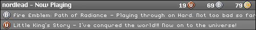
Nobody is ever going to agree on your biggest issue regarding the color schemes of the links. I was just discussing this with Brett, and frankly I think it's fantastic. It's very eye-catching to know what a topic/article is about without ever having to open it. If it's blue, I know immediately it's about Nintendo - red, it's Sony - green, it's MS... ...that's the ENTIRE reasoning behind it - it makes navigating to the things YOU are most interested in without even having to think. If you're most interested in one particular console or another, the colors will cue you right where to go... |
 (ah... seems there is an issue uploading images... the window that pops up when you click the tree icon is blank)

Cactus said:
Hah! Damnit, I just got conned out of $5. Does this mean that we get our VGChartz $ back now after the IM price reduction, since it's actually going to be used for something now? :P EDIT: is it just me who can't use smileys anymore, or were they taken away for good? |
awesome, I've already made 12.50 off of users clicking my FAQ 
As for smileys, they don't seem to be showing up, but you can use regular characters to activate some (like : - ) =  )
)
| CrazzyMan said: Come on, do something with color scheme, so much red, blue, green on black is not healthy.  How was. And how now:  |


I like it. It will take some time to get used but just like SmokedHostage's constantly changing avatars different is good.


OUCH!!!
My eyes!!!!!
TOO MUCH CONTRASTING COLORS!!!!
I don't like these colors at all.
In design, LESS is always BETTER.

I my honest opinion, i think the homepage is too convoluted, i prefered the linear style. Theres too much going on there.

About Us |
Terms of Use |
Privacy Policy |
Advertise |
Staff |
Contact
Display As Desktop
Display As Mobile
© 2006-2026 VGChartz Ltd. All rights reserved.

