By using this site, you agree to our Privacy Policy and our Terms of Use. Close

Forums - Website Topics - The official VGChartz 2.0 Thread

Cactus said:
One last thing. I think that the zoom in feature for boxarts is totally unnecessary since it just turns it into a pixelated mess, and when it is unzoomed, it's a bit too small. Just having a normal view of the boxart (like before) is probably a better idea.
this depends on the game. Before I asked talonman to make a change, all boxarts were shrunk down to 1 size. back when we went to multiple boxarts per game, we added the ability to save larger ones.

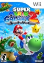
If you go to Super Mario Galaxy's page and zoom on the US boxart it looks fine. However, I'd love to see it improved for easier viewing of large boxarts.


If you drop a PS3 right on top of a Wii, it would definitely defeat it. Not so sure about the Xbox360. - mancandy
In the past we played games. In the future we watch games. - Forest-Spirit
11/03/09 Desposit: Mod Bribery (RolStoppable)  vg$ 500.00
06/03/09 Purchase: Moderator Privilege  vg$ -50,000.00

Nordlead Jr. Photo/Video Gallery!!! (Video Added 4/19/10)

Around the Network
iclim4 said:
Honestly, the main page is giving me a headache.
It's like a bunch of neon lights. Too much color.
Other than that, I like it.
I have to agree.  I like the general layout and color scheme, but the color coding of the font makes things to busy and hard to concentrate on one thing.

Also in regards to color on the weekly sales pages.  We have the old icons next to the games, but color coded names in the basic red/blue/green.  Then when you get down to hardware, we have new basic red/blue/green icons, but the old colors in the pie chart.  There just isn't much cohesion.

Wow, just wow!


It's time for me to spend more time here.


 Next Gen 

11/20/09 04:25 makingmusic476 Warning Other (Your avatar is borderline NSFW. Please keep it for as long as possible.)
TalonMan said:
The Ghost of RubangB said:
I miss seeing some game owners on each game page. There are some rare NES games that only me and a few others have, and whenever I see the 3 or 4 of us as the only owners of a game I feel like we're a special club.

I just resized the images in my sig, but they still came out gigantic. I can shrink them and rehost them myself I guess. Is anyone else having problems resizing images in sigs?

Well, if you click the 'owners' link, it'll bring up all the owners in a nice indexed list without having to page refresh - isn't that wonderful too??? :)
Oh it doesn't refresh?  That's cooler than I thought then.  But maybe it can appear when I scroll over "owners" instead of clicking it?  I'm too lazy to click some stuff, but I'll scroll over ANYTHING.  I love how that's working for the pull-down menus at the top of the page, and for the Forum Hot Topics section on the main page.

It's really different. But I like it. I'll just need some time to get use to it. But really nice work.

Love the new Vgchartz. Thanks to all the people who worked on it.


Around the Network
ioi said:
Wow, where to begin!

As stated in the OP this was intended to be a list of bugs etc but we can go over some of the stuff listed.

- Site width. Only 10% of visitors to vgchartz use a resolution less than 1280 wide, the site is set at 1150 wide so that 90% can feel the benefit and the remaining 10% can upgrade
Well can you at least give a suggestion of what we can do without having to buy a new laptop, because I don't want to be fucking around with a side scroll.... at least those who use widescreen are not inconvenienced by it being slimmer, but we are.

- Black backgrounds etc - this is the colour scheme of the site so you'll have to get used to it! I have no complaints there

- Homepage clutter - what we've done is actually compress all the stuff on the homepage so you don't have to scroll down 5 times to see what you want - most of the main stuff is above the fold and accessible via tabs etc. I think it's neat and clean and a ten times improvement over the old homepage which was a cluttered mess with no coherancy or theme. Again,  I think it is great.... except for the bad colour scheme thing I mentioned with green and red text and such.... I think if that is changed people won't be complaining of clutter so much.

- Site is quite slow - we need to improve the performance of some aspects The thread speed seems to be back to normal already

- Control panel / my recent threads being moved - we have no left sidebar anymore as you can see on the homepage, the control panel has been compressed to a neat box and the forum threads is shown when you are on a forum page. It's a shame, but I can live with it...

- Game page layout is poor? Please expand on this - the game page is the area that has had the most work and should now offer a huge amount of depth and functionality. I agree, not sure what Okey's problem is.... one thing is that the game pages are still laggy though.

As a general point, we expected some regular users to dislike some of the changes to the site. It is a pretty general issue - you like the site as it was, which is why you signed up, like it to be small, intimate, different. Unfortunately, VGChartz cannot survive being small and intimate, it has to evolve and develop and become more professional. A lot of the changes are designed to attract more users and traffic to the site, to allow us to post and handle more news stories, to expand the game database, to add more social networking features. Stuff like removing recent threads from the homepage - recent threads belongs in the forum in my opinion, not on the homepage or game pages or news pages.

Basically all the non-forum areas of the site have been improved and there will be some small cost to the forum in order to make other areas of the site more prominent, but that is the direction VGChartz is taking I'm afraid. The guy who said "remove the charts and news stuff from the front page and add recent threads back" kinda sums the issue up perfectly... that, and the fact that some people just don't like change. I had all the same complaints when we carried out the last redesign - the difference this time is that it's not just a graphical overhaul but a ton of new features and functionality has been added. Once again, I agree.... the recent threads is only a minor inconvenience really.
Ta ioi.... good stuff.

just for a little repetition.... please scrap the mutlple coloured thread titles/game titles.... It is the one thing that looks LESS proffessional. Especially given those three colours don't go well on black/grey.


When are you guys removing the "hot" topics sections from the front page? I know that some members like it.But if ioi wants the site to look more professional then members should not be lazy and go to the forums so they can search for the respective topics they want.


Is it just me or is this site heavy on some CPU's and it's slow and still has the blank box when trying to add an image to a sig or a post.

It's just a bloated mess


TalonMan said:
matt247 said:
Why is there no comment box when I'm on the 2nd page of a thread?

Not sure what you mean? 2nd page of what thread???
I think the thread got locked before he clicked on "next page."

I gave up on shrinking the images in my sig, and tried deleting them. It just won't let me edit my sig at all. I hit "save" and then nothing's changed. But when I go back to my page and hit "edit profile" again, my sig is different. The text and link reflect the changes I just made, but the images are gigantic again.