By using this site, you agree to our Privacy Policy and our Terms of Use. Close

Forums - Nintendo - Nintendo SwitchEuropeNintendo Of Europe Updates Regional Websites Ahead Of Full Switch Announcement

This week will see the full reveal of the Nintendo Switch, and as part of its preparation for this event Nintendo of Europe has given its regional websites a timely face-lift.

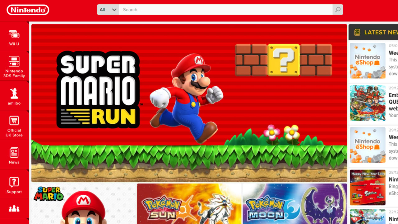
The old grey, white and blue of the Wii and DS era has all but disappeared and now Nintendo is using a bold red and white design - which naturally ties in perfectly with the branding for the Switch.

The design has been rolled out across all of Nintendo of Europe's related territories, but you can view the UK portal here. Have a snoop around and let us know your thoughts.

http://www.nintendolife.com/news/2017/01/nintendo_of_europe_updates_regional_websites_ahead_of_full_switch_announcement

http://www.nintendo.co.uk/


Around the Network

I think red is a terrible primary color for a website. Such a strain on your eyes.


If you demand respect or gratitude for your volunteer work, you're doing volunteering wrong.

The design is nice, but they still have to fix the MyNintendo system. And with that, I mean make better deals. Now that the Switch is coming, offer people multiple special discounts, or offer really great Switch deals to make people buy it day one. But add more stuff! More than 1000 of my silver points expired already because I don't care about anything offered there.


You know it deserves the GOTY.

Come join The 2018 Obscure Game Monthly Review Thread.

vivster said:
I think red is a terrible primary color for a website. Such a strain on your eyes.

It is, but it's also the first color that catches your eye. Marketing-wise, it's a very clever design choice. And since I assume Switch's boxarts will be red, the website needs to be in line with the color.


Red is Italian colour.
Basically Ducati and Ferrari machines are all red.


Around the Network
vivster said:
I think red is a terrible primary color for a website. Such a strain on your eyes.

I think it great they are backing back to whole red Nintendo thing, I missed that in Wii and Wii U era.


Darwinianevolution said:
The design is nice, but they still have to fix the MyNintendo system. And with that, I mean make better deals. Now that the Switch is coming, offer people multiple special discounts, or offer really great Switch deals to make people buy it day one. But add more stuff! More than 1000 of my silver points expired already because I don't care about anything offered there.

To be fair those silver coins are the free coins. You cant really expect much from them.
The fact that they offer up to 30% off on games like Shantae, SMG, NES Remix is a pretty great deal.


ktay95 said:
Darwinianevolution said:
The design is nice, but they still have to fix the MyNintendo system. And with that, I mean make better deals. Now that the Switch is coming, offer people multiple special discounts, or offer really great Switch deals to make people buy it day one. But add more stuff! More than 1000 of my silver points expired already because I don't care about anything offered there.

To be fair those silver coins are the free coins. You cant really expect much from them.
The fact that they offer up to 30% off on games like Shantae, SMG, NES Remix is a pretty great deal.

I just want more free Picross games, like the TP one :(


You know it deserves the GOTY.

Come join The 2018 Obscure Game Monthly Review Thread.

I don't mind the red, it brings me back a bit.


       ---Member of the official Squeezol Fanclub---

guiduc said:
vivster said:
I think red is a terrible primary color for a website. Such a strain on your eyes.

It is, but it's also the first color that catches your eye. Marketing-wise, it's a very clever design choice. And since I assume Switch's boxarts will be red, the website needs to be in line with the color.

Why would a website need to catch your eye when you're already on it? It just makes it hard to find anything when all you get is red color screaming in your face.


If you demand respect or gratitude for your volunteer work, you're doing volunteering wrong.