I think the blue design looks good. As long as I can easily tell between them and Wii games I'm good. That's the issue with DS/3DS. The boxes look too much alike.
I'm a fan of it. I hope Nintendo do a lot more limited/collector editions for their games this time around.
im loving the WiiU boxart logo
now that i think about it, i hope ps4 goes with smaller sized see through cases similar to the ps3s
Two things about this:
August 8th, 2012 Posted in News, Posted by Valay, Wii U | 1 Comment »
Nintendo has gone ahead and confirmed that the Wii U boxarts we’ve been seeing are real. You probably figured that at this point, but it wasn’t until today that the Big N actually confirmed the design.
Here’s what will happen with Nintendo’s own Wii U boxarts going forward:
“[First party] boxes will appear shortly w/ placeholder logos, and then ultimately with the final artwork for each game.”
So now that the Wii U boxarts are final, what do you think? It’s a change from Wii, but the design is sort of comparable to the GameCube cover.
--------
2 - Best thing about this boxes is not the logo, but the color
VicViper said: Two things about this: 1 - Nintendo says Wii U boxart design is realAugust 8th, 2012 Posted in News, Posted by Valay, Wii U | 1 Comment » Nintendo has gone ahead and confirmed that the Wii U boxarts we’ve been seeing are real. You probably figured that at this point, but it wasn’t until today that the Big N actually confirmed the design. Here’s what will happen with Nintendo’s own Wii U boxarts going forward: “[First party] boxes will appear shortly w/ placeholder logos, and then ultimately with the final artwork for each game.” So now that the Wii U boxarts are final, what do you think? It’s a change from Wii, but the design is sort of comparable to the GameCube cover. |
I guess it's official then. Good deal!
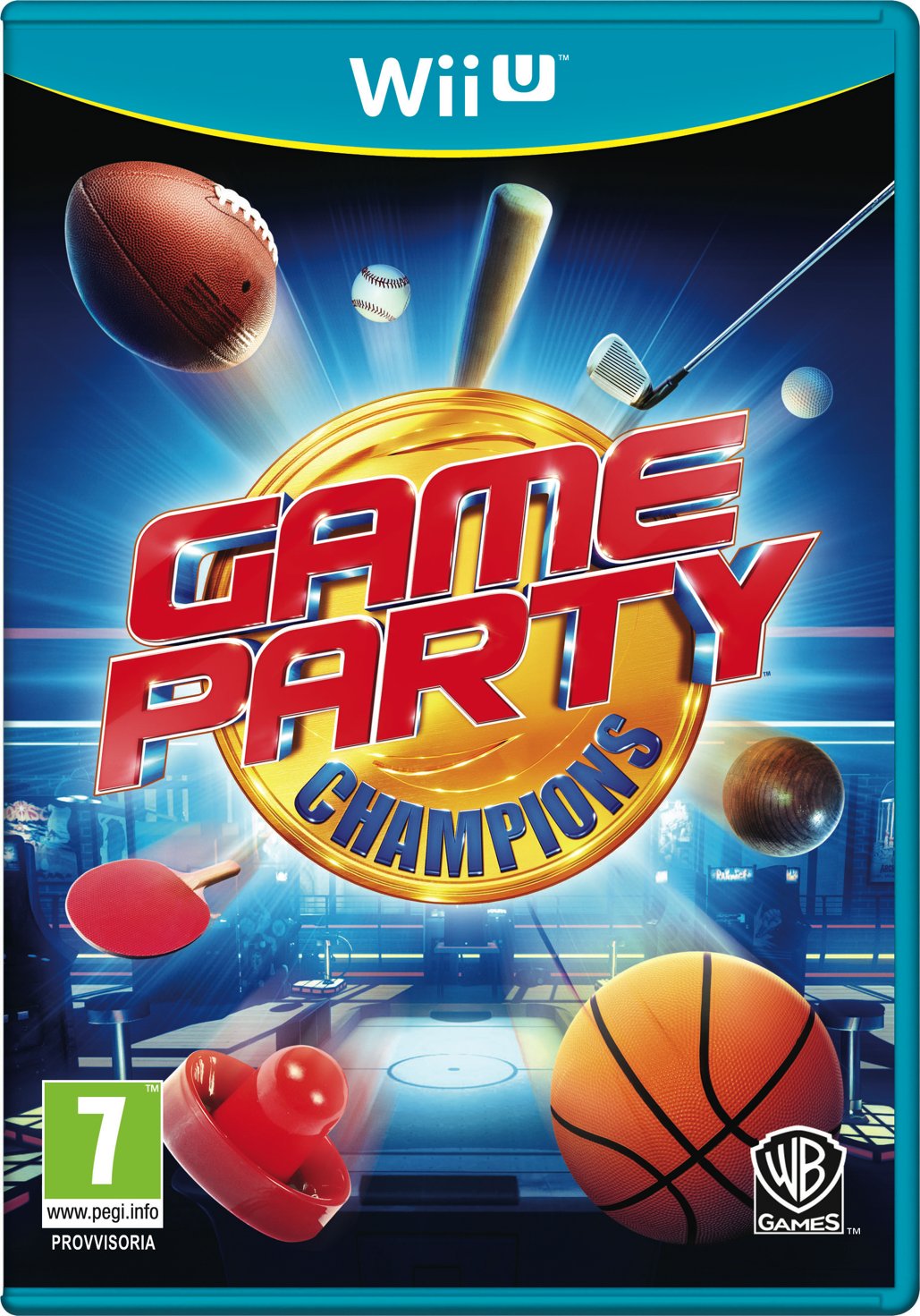
haha I don't know why, but I'm getting a 80's vibe from "Game Party"!!
I'm on Twitter @DanneSandin!
Furthermore, I think VGChartz should add a "Like"-button.
DanneSandin said: haha I don't know why, but I'm getting a 80's vibe from "Game Party"!! |
It's the powerglove-like dark background with smoke-exhuding objects in the foreground. Add to that some flashy colors and old-school games like air-hockey and bowling, and there you are, sucked into the past. ;)
GameCube throwbacks with soft blue cases... nice.
And damn whoever made those mockups for making me thing Metroid Prime was getting an HD remake lol.
On 2/24/13, MB1025 said:
You know I was always wondering why no one ever used the dollar sign for $ony, but then I realized they have no money so it would be pointless.
Blue cases, huh?
They should make them slightly transparent like the 360 cases. That would be too awesome to be true!
I saw the Metroid one and I was like
and then i read that it was just a mock up and I was like
Been away for a bit, but sneaking back in.
Gaming on: PS4, PC, 3DS. Got a Switch! Mainly to play Smash
About Us |
Terms of Use |
Privacy Policy |
Advertise |
Staff |
Contact
Display As Desktop
Display As Mobile
© 2006-2025 VGChartz Ltd. All rights reserved.