
ImJustBayuum on 01 June 2010
Comparative to old design
- aesthetically = excellent
- user friendliness = 0
Before, the site was a bit clutter, now its a bit all over the place, too decentralised..IMO


Comparative to old design
Before, the site was a bit clutter, now its a bit all over the place, too decentralised..IMO
Maybe we can strike a balance somewhere?
The older one have too many things on the main page, while this one have everything split up and a chore to go around.
How about trying to keep the nice clean look like the new version but put back the ease of navigation of the old version?

I would say I am disappointed in the color scheme. The font colors used are not easily readable and annoys my eyes. You have the front page fonts and background on different levels of gray, it just doesn't look easily readable to me.
I would have to agree that the web site lost some of its appear. I used to like the coloring of games in top games to distinguish between consoles, I don't believe that exist anymore. I would also feel that the forum is plain and the coloring theme is not appealing as in the previous design. Finally, the navigation seems to be more complicated than the old version.
I understand that a lot of effort has been put in the new web site and thanks to all who participated. Criticism to make things better is not complaining by the way.


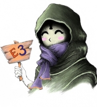
I am not going to list why I am and am not liking this, but I really wish they would have waited until after E3. It is a mess to find my way aorund currently and that is very bad for when E3 comes. I might have to go elsewhere for my E3 news. =/


Arg this'll take some getting used to. It's a lot prettier, I really dig the look, but also admittedly I miss the convenience VGChartz 2.0 provided.
Call me a throw back, but I actually prefer the original VGChartz the most, though now I barely even remember what it looked like.
PSN: chenguo4
Current playing: No More Heroes

| chenguo4 said: Arg this'll take some getting used to. It's a lot prettier, I really dig the look, but also admittedly I miss the convenience VGChartz 2.0 provided. Call me a throw back, but I actually prefer the original VGChartz the most, though now I barely even remember what it looked like. |
I actually don't mind the look and to be honest I've learned after the last upgrade to give it time to grow on me.
One thing I have to give them props for is performance. The site seems to run alot more smoothly than previously and is alot less resource intensive.

| Games4Fun said: I am not going to list why I am and am not liking this, but I really wish they would have waited until after E3. It is a mess to find my way aorund currently and that is very bad for when E3 comes. I might have to go elsewhere for my E3 news. =/ |
How is it a mess exactly? I just don't understand what you mean precisely. I mean, aren't you currently in the forums? And didn't you just post like 10 times since the new site has been up?
I can help, lol. o_O
Random game thought :
Why is Bionic Commando Rearmed 2 getting so much hate? We finally get a real game and they're not even satisfied... I'm starting to hate the gaming community so f****** much...

Well like most new things I'm scared and done understand it so automatically I hate it!


Is there a way to refresh the 'Recent Threads' without completely refreshing the page? I liked that a lot about the previous vgchartz.

About Us |
Terms of Use |
Privacy Policy |
Advertise |
Staff |
Contact
Display As Desktop
Display As Mobile
© 2006-2026 VGChartz Ltd. All rights reserved.