By using this site, you agree to our Privacy Policy and our Terms of Use. Close

Forums - Gaming - The Best and Worst of Video Game Box Art

What are some of your picks for both the most awesome and amazing video game box art, and also the most hilariously terrible?

Hit us with the best (and worst) you've got!


Around the Network
curl-6 said:

What are some of your picks for both the most awesome and amazing video game box art, and also the most hilariously terrible?

Hit us with the best (and worst) you've got!

This is indeed some of the best boxart ever. They did it on purpose to stand out from all the other shooters of the time. 30 plus years later people still talk about it. They did their job.

I will also post a good one.


Bite my shiny metal cockpit!

Probably the cheesiest NES art I can think of:

But there were lots of garbage covers for the Sega Master System:


Also, I don't think Captain Kirk ever got paid for posing for the Strider box art.  


This is peak


Around the Network
Louie_86 said:

This is peak

I had this one.


This was an interesting choice.

Very minimalist, but it also showed off just how powerful PS1-era Square really was in Japan. They didn't need a bunch of elaborate box art. They could sell this game with just a logo on the white background. But at the same time, it was also clean and elegant, an opposite number of the often garish covers of the time.

Nintendo of America took a similar approach a decade earlier.

Again, rather minimalist, and very unlike Nintendo's typical box art of the day, which was to have pixel art from the game showing the main character in some kind of action pose. Nintendo wanted to convey to gamers that this game was something special and get their interest piqued. It's hard to describe the feeling of seeing this in the locked game case at Walmart back in the mid-80s. 


Here we have a hunter pointing his shotgun into the shky, oblivious to the duck that's right behind him... or the gigantic dog that's about to eat both of them.
Because Japanese publishers thought Americans would be turned off by anime art, they gave their RPGs generic Western-style fantasy art. This cover was actually painted by Boris Vallejo, who was famous for his paintings of Conan the Barbarian and 1980s movie posters.

That's part of why Working Designs was so revolutionary at the time, regardless of what you might think of their localizations today. They didn't try to hide the anime origins of the games they localized. 


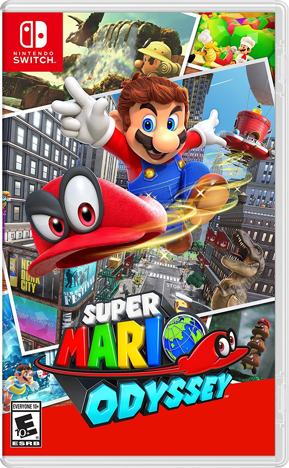
You simply cannot top this. It does not decieve with any pre-rendered artwork (excluding the Mario model slapped right in the middle of the collage), it relies heavily on in-game screenshots, and it does so in a fashion which perfectly matches the "travelling" setting of the game.