Walter_Kovacs1986 said:
|
You've got a point there, never noticed that lol.
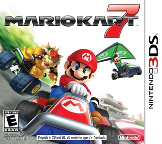
I dunno I guess it's because of the logo... I prefer the classic colorful "MK" logo rather than the newer gray and silverish one over a white background like the box art for DS, Wii and 7
On 2/24/13, MB1025 said:
You know I was always wondering why no one ever used the dollar sign for $ony, but then I realized they have no money so it would be pointless.


