wfz on 11 January 2013
Mnementh said:
I don't understand really what you want. |

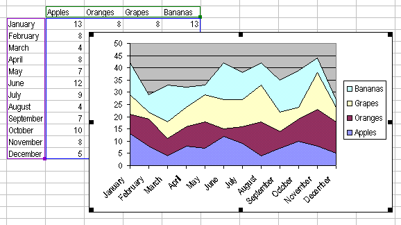
Make stacked area charts with a different line for each console. Y axis labeling (EDIT: Screwed up here, I meant X axis) is in years. Does that make more sense? (Area charts are line charts with everything under the line filled with a certain color. If you use a stacked area chart it combines the lines in a cumulative fashion).
Here, a picture can explain a thousand words.