zarx said:
darkknightkryta said:
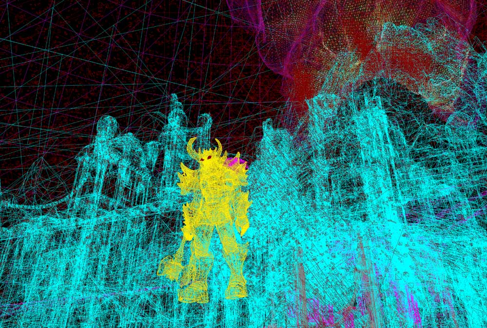
I think I see the problem now with the UE4 images, it's that character they created. The normal maps they're using are really bad. He's very angular in nature, probably to hide the low amount of polygons they used to make him with. The texturing on him is borderline low res (decently far away he looks good though, up close on the other hand). Though the environments are good. I am still dissapointed with the lighting and shading though. Looking at the model again light isn't scattering over the model, it's being handled by the normal maps and poorly. Compared to the Samartarian demo, this is really a step back, hell half the stuff they wanted in the Samartian demo isn't in this demo (The fancy boketh(however it's spelled)blur, reflections, etc). I'll go on a whim and say they just rushed this demo, or it was made with the older consoles in mind. |
Doesn't look that low polly

|
I was refering to the character model itself, scenery was very well done. But That model does have a lot of polygons, from the tesselation, but that's the flaw with tesselation, subdivide a square into 1000 little squares doesn't give you more details. Like I had said, the demo was most likely rushed, tesselation on a character model isn't useful without the displacement map on it for details, which is what is missing from that character. You can see it on the close up of his face.
