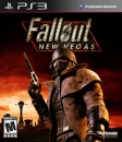
I think the fact that the PS3 Logo is on the side rather than on top like the 360 logo might have something to do with why the Green and White doesn't work to well for a few games. The Wii's is just White which would work for almost anything, and the changes in height along the border add a nice sense of style.
I myself really like the PS3, DS and Wii borders/Labels the most. Don't really favor the PSP and 360's. I also find the yellow border around Eu Platinum games border for PS3 HORRIBLE. The silver they used last gen for PS2 was much better.
4 ≈ One


