As you may or may not know, everytime I reach a thousand more posts (2000-3000-etc...) it has become a habit of mine to completly change my look (avatar and sig), and as I am now 100 or so away from 4000 posts its time to build hype for this new look. Version 4.0 will be very different as the sig is being 100% designed by me, no pictures no nothing pre-made, all me and MS paint. the avatar, well if you knew me well enough you can see it coming a mile away haha. But it suits me well.
So heres a little historic of what Iv looked like to all of you.
O-D-C Version 1.0 (Humble beginings) 0-1000 posts ( I think)
Avatars - 

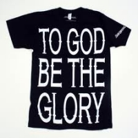
Sig - A random mish-mash of text (favorite games and currently playing) very boring.
A very simple begining indeed, but version 1.0 cannot be overlooked as important as it began my theory of having avatars that are at the time unique and easy to remember.
O-D-C Version 2.0 (A Lot About Me) 1001-2000 Posts
Avatar - 
Sig - 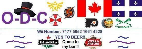
Ah version 2.0, arguably my least favorite of my looks. the avatar is nice, with a bright purple and red, (Ruby Gloom btw) but the sig is litteraly a giant mess. I was trying to give you all an insite into my favorite things and myself. With my three favorite game series (Zelda, Metroid and Resident Evil) being shown, my favorite hockey team (Philadelphia Flyers) a bowling ball (I own this exact ball) and a lacross image (great sport) I also included my Wii number and my too favorite beers. Version 2.0 is famous for being my 1st and only sig featuring my bar in the sig itself and not as a simple hyperlink. I also included Goldbob's hat as an omage to my former avatar.
O-D-C Verison 3.0 (A Unified Design) 2001-3000 posts
Avatar - 
Sig - 
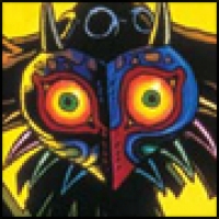
With version 3.0 I wanted to capture the dark mood of my favorite game (The Legend Of Zelda: Majora's Mask), represented by my avatar into my sig, but not build an entirely Majora themed one. So I went with dark colors, (Black, Purple and Blue) as well as a sad looking Ruby Gloom (Again as a reference to a previous version) this all went well together. About 3 posts before number 3000 I decided to add the maple leaf and fleur de lys to show my Canadian pride as well as my French and Quebecois heritage.
Version 4.0 (A Preview) 4001 - 5000 posts (tentative)
The following are hints and guess at what version 4.0 will look like once its ready to be unveiled.
Avatar - * HINT * Tim Burton (no its not a picture of Tim Burton)
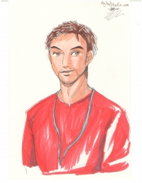
Sig - Preview (heres a sneak peak at my upcoming sig) keep in mind everything on it will be made by me, not internet copy / paste this time.

Hope you all have enjoyed this little O-D-C retrospective, and i look forward to showing all of you my new look soon! :)