
Majin-Tenshinhan on 18 November 2008
I think it looks alright, but nothing spectacular. Neither good nor bad, really.


I think it looks alright, but nothing spectacular. Neither good nor bad, really.

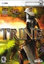
Looks pretty lame to me. I generally prefer the Japanese box art for titles but there's a chance the NA art could be better this time. It should have been an illustration.
I love a cover that uses some nice concept art, like the Japanese ICO cover, among others.
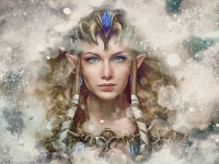
Of course, we'll probably get some close up of the main character's face or something else just as ugly here in NA.


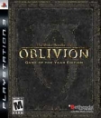
I think it is kind of boring. I don't really know why, but I think it may be because of the knight's design, its not my thing.

| makingmusic476 said: I love a cover that uses some nice concept art, like the Japanese ICO cover, among others. Of course, we'll probably get some close up of the main character's face or something else just as ugly here in NA. |


bbsin said:
|
LOL!!!
Well, i can only assume the USA/EU will look something like.......

About Us |
Terms of Use |
Privacy Policy |
Advertise |
Staff |
Contact
Display As Desktop
Display As Mobile
© 2006-2026 VGChartz Ltd. All rights reserved.
