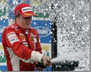


And with that, a picture of me in Canifis.
(right click, "view image" to see the whole thing)
But yes, the so-called "HD-mode" discueed here has launched its beta mode. We're playing HD RS over two weeks earlier than we thought we would be! That's pretty hot stuff, guys. I believe it's only available for members, however.
With that, here are my impressions, copied directly from my thread on the RS Forums
When I hopped on my computer tonight, I was thoroughly surprised with the update to the Runescape website. As soon as I saw that the site was so drastically changed, I did two things.
First, I sat, dumbfounded, for a second.
Second, I gathered my senses, and IMMEDIATELY checked the updates section to see what was up. Here, I saw that the HD mode beta is currently available to play.
I loaded it up and started playing. Needless to say, I was definitely pleased. It looks FANTASTIC compared to old RS2 graphics. On a technical POV, I'd have to say "old RS2" was somewhere along the lines of an early N64 game in graphical appearance, and the "new HD RS2" looks something like an early Gamecube game. That, friends, is major improvement.
However, I noticed many ways in which it lacked... and I noticed them rather quickly. With how quickly I noticed them, I have to say... that's not good.
First off, when told I'd be able to pick different resolutions, I didn't realize this was only for fullscreen mode. And, sadly, my computer doesn't like any resolutions for fullscreen mode except the one it's currently set for anyways, so that ability doesn't even effect me, really. When Jagex announced that we'd be able to choose resolutions, I thought we'd have the function to change the size of the RS client in the window. Frankly, with how much better HD mode looks, the tiny window we currently have to use is simply inadequate. I motion that we should be able to change the size by percentages - the current size is 100%, but perhaps we can change it to 125%, or 150%. And maybe we should be able to also choose 4:3 aspect ratio (what it's at by default), or 16:9 widescreen. Again, these options are ONLY FOR WINDOW MODE. Personally, I prefer to NOT play fullscreen, because I run on a dual-monitor system and fullscreen mode prevents me from being able to do things on my second monitor (as soon as I click anywhere on the second monitor, it instantly switches back to window mode).
Don't get me wrong - I love fullscreen mode, and I'll definitely be using it a lot. But, for any times that I want to use my second monitor, I have to suffer with the itty little window mode. Give us size options! Just three sizes + two aspect ratios and that solves EVERYTHING!
Now, moving on to the fullscreen mode. I noticed a few issues with this... and they are ALL to do with the HUD (Heads-up display... the user interface).
Firstly, the buttons for the control bar. Now that they're all in a row, I oftentimes find myself moving down to use my magic... and I just end up looking at it for a second or two, thinking of where I need to click. Then I end up clicking on prayer. Every single time. I'm sure I'll get used to it, yeah, but it's annoying. There's so many of them! I have a very simple solution to this, and it hails back to Runescape Classic. Remember the way you had to mouseover each tab to access it? I'm not saying we make it like that again, but I think a similar function would be PERFECT! I think each tab should pop up when you mouseover the tab, and you can click on it to get it to stay up. Click on it again to close it, just like you already do. This way, when I'm looking for the tab I want, I just mouseover until I see the list of spells, or my inventory, or whatever function it is that I'm looking for. Don't even HAVE to remember the darned icons!
Secondly, the spacing. Everything is so stinking far apart, and I don't even use that high of a resolution! I can't imagine what you geeks out there with 22-inch screens do. Simple solution: each section of the screen - the map, the control bar, and the chat box - should have a "corner" that you can drag out to a certain point on the screen to extend it. Just like enlarging a window in Windows, you just click and drag the corner of the box and it makes it bigger! Of course, Jagex would want to set boundaries to how far we can drag it - no sense letting people cover the entire screen. However, with this function, people that REALLY like the map function can put a lot of emphasis on that, but if they don't like chatting often, they can shrink that down as small as possible. Or maybe you spend a LOT of time chatting with people in one spot, and you're not doing anything else. Why not extend the chat box, then shrink everything else? When extending these boxes, it will allow them to display more (the map would show a larger circle of land, and the chat box would show more lines of text), and it would also allow them to display LARGER items (the font size in the chat box is REALLY small for fullscreen... if I could enlarge it one or two font sizes, perfect!). I think the larger font + more lines of text should BOTH happen together with the chat box, but that's up to Jagex to toy around with.
Third, why shouldn't we just be able to position the different items wherever we want on the screen? I say each item - the chat box, the map, and the control bar - should be floating items that we can position wherever we want on the screen, just like a window over top of our desktop in Windows. Depending on where we orient certain items on the screen, they'd position themselves differently (maybe we put the map in the bottom left corner - now the logout button should swap sides with the other buttons by the map, y'know? Or maybe we put the control bar over there - now the pop-up contents of each tab would show up on the left side of the bar instead of the right).
Lastly, back to the control bar. Now that we've got fullscreen mode and all this space, there are so many possibilities! I think we should have a right-click function when clicking on each tab. Left-clicking, by default, just opens up that tab. But if we RIGHT-CLICK, it would give us another function to open up a SECOND tab above the first one! This way, we could have our prayers AND magic open at once, or our inventory and equipped-items screens both accessable! The benefits of being able to do this really don't end - there are a LOT of nice things we could do with this, and it'd really open up a lot of possibilties.
Really, every single one of these ideas would open up a lot of possibilities. Runescape has broken a tremendous threshold, and it'd be a shame if Jagex didn't make it as good as possible. Beta versions, after all, are for testing the water and getting feedback on ways to improve the game... and I'm telling you now, every single one of these functions would tremendously improve the game. Function #3 is probably the most complicated to code, and COULD cause the game to require more processor power and memory (if not coded properly), but that's okay, because it's probably the least beneficial to the game. Every single other concept, however, would improve the Runescape experience tremendously. Frankly, I see myself tiring of fullscreen mode if some of these issues aren't remedied. It's beautiful and I love using it right now, but I have to say - these things are going to bother me eventually.
And I know I'm not the only one. If you agree, follow the link above to my thread and post your support.
In other news, DISCUSS!
![]() SW-5120-1900-6153
SW-5120-1900-6153