
Sqrl on 17 April 2008
I'm going to be using this thread as a quick reference for the graphs I've used in my articles so it will be updated as new articles are posted.
Currently Available:
Part 1: The Basics
Part 2: The Past & Future
Part 3: Quarterly Review
Graphs Part 1:


Graphs Part 2
|
 |
|
|
 |
|
|
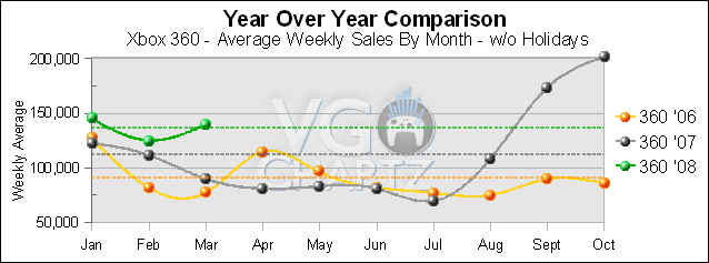 |
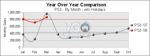
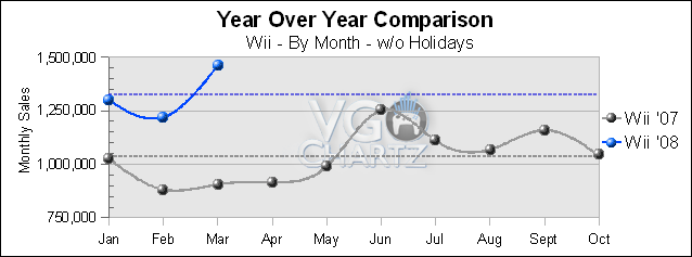
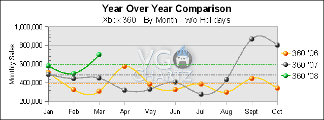
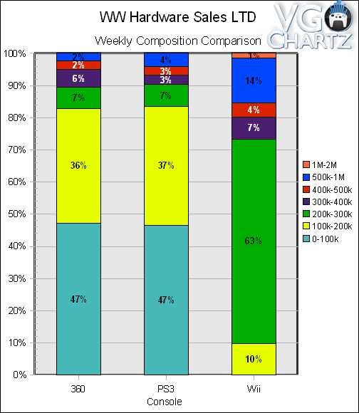
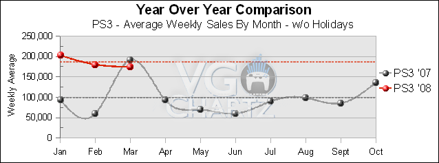
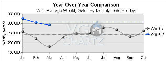
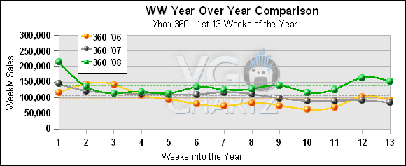
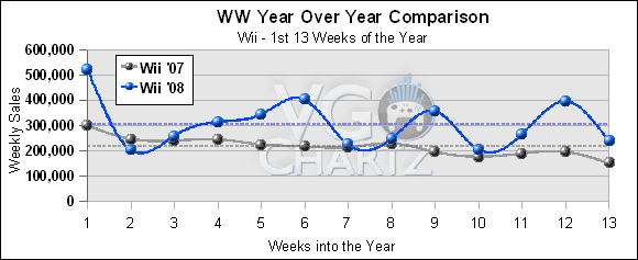
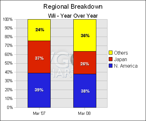
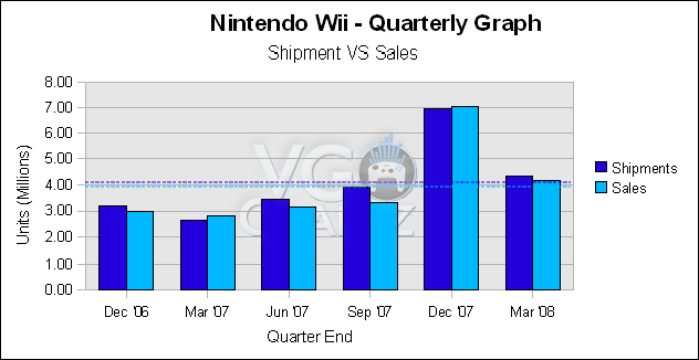
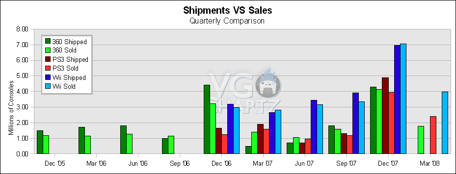
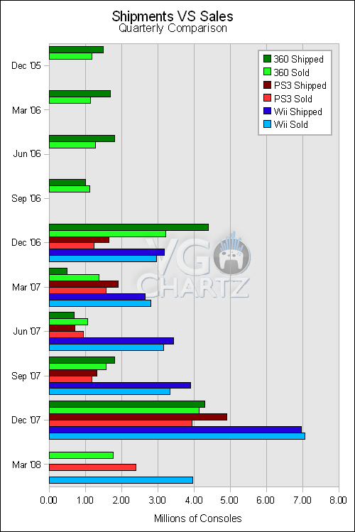
Graphs Part 3
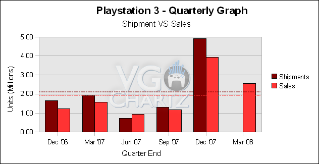
Note: I need to update these next two graphs but I'm not at home at the moment so I can't, they will have the missing quarterly info added later today.
 |
| To Each Man, Responsibility |