
That Guy on 06 April 2008
Dear DSoverPSP,
I like your signature, except it could use more smilies.
Sincerely,
Crazzyman
=))))))))))))))))))))))))))))))))))


Dear DSoverPSP,
I like your signature, except it could use more smilies.
Sincerely,
Crazzyman
=))))))))))))))))))))))))))))))))))

| Tavin said: too many smileys :S and waaay too shining.... it hurts my eyes =(
rate ? ... like a 60 ... it's not ugly .. but it's a little bit too much |
*splashes water on eyes*
come on guys, it's not that Shiny - only Orange and Green

your sig is fine, but you may want to change the green, it makes the writting slightly harder to read. otherwise its fine, unique and individual. 96/100

dsoverpsp said:
*splashes water on eyes* come on guys, it's not that Shiny - only Orange and Green |
why not blue or a less shiny color
pichu_pichu said:
why not blue or a less shiny color |
@dsoverpsp: Thanks for the water ... you saved my eyes
the thing is that all those freaking smileys are the shining ones :P not the color of the lines
and like pichu said ... you could use some less brilliant colors :D
-- Live only for tomorrow, and you will have a lot of empty yesterdays today--
Tavin: "Old school megaman is THE BEST megaman" courtesy of fkusumot :)
My mind has changed. My strength has not. Kamahl, Fist of Krosa

This topic must go up.
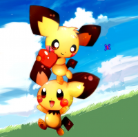
Spread the kawaii goodness!

oh god my eyes!
4/10
i think it would be best if you changed the colors to something more neutral, took out the smiley faces, and then all your text goes in the middle where the smiley faces were. That would direct attention to the middle and it would be SO MUCH EASIER TO READ =))))))))

Damn, my eyes burn!
No offense dude, but these colors are just... annoying? And reading the black letters in the dark green is blinding...
Also, take out the smiles.
And squirtle > charmander, but this one i'll let go lol
Other than that... Okay
4/10

Flow -"The important is to pwn other ppl"

About Us |
Terms of Use |
Privacy Policy |
Advertise |
Staff |
Contact
Display As Desktop
Display As Mobile
© 2006-2026 VGChartz Ltd. All rights reserved.
