Jon-Erich said:
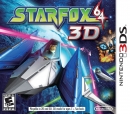
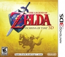
This is why most box art for games is bland and uninspiring. Companies somehow feel that predictable, boring artwork is the best way to communicate with the impulse shopper. |
Maybe (Bioshock etc), but I feel like with this there is definitely room to convey the chaos, vibrancy of it in a more appealing fashion. Its nothing to do with the style of the game/thus this image and everything to do with design but maybe I'm just too picky. That corporate blue paint is really off putting, should have replaced it with turquise or something.


