
Words Of Wisdom on 31 January 2008
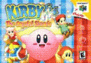
US box art is better as it feels more ominous and fitting to the game.


US box art is better as it feels more ominous and fitting to the game.

I think that cover is better than the US one.
100% Coritiba Foot Ball Club!
Friggin' awesome. The American version is good, but the Japanese version sings to me. I think the "Phazon" color scheme is more than appropriate. I wish it spot lighted the "corrupted" Samus instead of the classic tangerine colored Samus, but I'm just nit-picking.

| Tifa Lockhart said: I don't like it. Reminds me too much of the corny Justice League. |
Oh, Tifa. Comments like that are why Cloud prefers Aeris! The Justice League is not corny. It's the best super hero cartoon ever!
About Us |
Terms of Use |
Privacy Policy |
Advertise |
Staff |
Contact
Display As Desktop
Display As Mobile
© 2006-2026 VGChartz Ltd. All rights reserved.
