


PSwii60 on 05 March 2013
This has to be the most direct, and simplest logo I have seen. This is my vote.











This has to be the most direct, and simplest logo I have seen. This is my vote.


Logos don't need to be full of characters, colors, or letters, or worse: huge to be effective; it just needs to be simple and direct. Besides, gamers already know what each company represents and their characters as it is.


| PSwii60 said: This has to be the most direct, and simplest logo I have seen. This is my vote. |
I don't actualy like that one and I'll tell you the five reasons why.
1. It's animated
2. It is needlessly incomplete. Each symbol has been sliced for no practical or aesthetic reason.
3. It is a found image and wasn't designed for Playstation Nation which is why it lacks any VGC branding or team name.
4. The masking is screwed up. When the "lights" flash on and off you can see where they were amateurishly cut out.
5. Low res
The only thing it has going for it is its simplicity. But I think the cons out way the one pro.





kain_kusanagi said:
Yep. I made them. I did make some for Team Nintendo as well. But people can use what they want.
Light Version:
1/2 Size Code:
Black Version:
1/2 Size Code:
|
My request for MIZ to make one is still my favorite from Nintendo.
I basically told MIZ what characters and gave him 3 different suggestions for background, and made my Logo for Team Nintendo.
But I can give you a suggestion for a completely different logo if you still want to try to make a cool one.
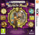
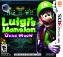
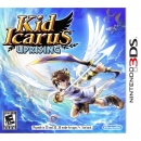
For characters; Mario & link (from wii u demo) & Donkey Kong (can be cartoon image) & Iwata Mii & Reggie Mii & steel diver submarine (the blue one) & Banjo Kazooie (can be cartoon image) & Chrom from Fire emblem awakening (can be cartoon image instead) & captain Falcon (can be a cartoon image) & that main charecter from "Rhythm Thief and the Emperor's Treasure" (can be a cartoon image) & Sakura from Sakurai Samurai: Art of the Sword (it can be a cartoon image) & Dark Pit (graphic image) & Pyrrhon (graphic image or maybe aurum pyrrhon cartoon image from AR card) & Lugia & Pichu & that Y legendary from Pokémon Y & Mewtwo & Black Kyurem.
And for the background, well a combination of the star fox 64 3D solar system level selection map & Mario galaxy 1 and/or 2 outer space.
And of course it has to say Nintendomination in it somewhere.


kain_kusanagi said:
I don't actualy like that one and I'll tell you the five reasons why. 1. It's animated 2. It is needlessly incomplete. Each symbol has been sliced for no practical or aesthetic reason. 3. It is a found image and wasn't designed for Playstation Nation which is why it lacks any VGC branding or team name. 4. The masking is screwed up. When the "lights" flash on and off you can see where they were amateurishly cut out. 5. Low res The only thing it has going for it is its simplicity. But I think the cons out way the one pro. |
1. Well, I like animated, but I guess it does contradicts the essense of a logo.
2. It's supposed to represent the futuristic feel
3-5. You got me on this; I was just thinking this actually after I posted it and really paid attention to it. LOL
Still, it'd be nice to see a simple logo, nothing extravagant. I'd create one but I lack artistic skills. I looked around the web, too, and hope to modify it but I found even worse NEWBs of images.


PSwii60 said:
1. Well, I like animated, but I guess it does contradicts the essense of a logo. 2. It's supposed to represent the futuristic feel 3-5. You got me on this; I was just thinking this actually after I posted it and really paid attention to it. LOL Still, it'd be nice to see a simple logo, nothing extravagant. I'd create one but I lack artistic skills. I looked around the web, too, and hope to modify it but I found even worse NEWBs of images. |
Well, I'm more with PSwii60 on this, but yeah he gots us on 3 to 5.
I still like this image as well, especially for reason #2. (sliced up for futuristic look)


Kaizar said:
I basically told MIZ what characters and gave him 3 different suggestions for background, and made my Logo for Team Nintendo. But I can give you a suggestion for a completely different logo if you still want to try to make a cool one. For characters; Mario & link (from wii u demo) & Donkey Kong (can be cartoon image) & Iwata Mii & Reggie Mii & steel diver submarine (the blue one) & Banjo Kazooie (can be cartoon image) & Chrom from Fire emblem awakening (can be cartoon image instead) & captain Falcon (can be a cartoon image) & that main charecter from "Rhythm Thief and the Emperor's Treasure" (can be a cartoon image) & Sakura from Sakurai Samurai: Art of the Sword (it can be a cartoon image) & Dark Pit (graphic image) & Pyrrhon (graphic image or maybe aurum pyrrhon cartoon image from AR card) & Lugia & Pichu & that Y legendary from Pokémon Y & Mewtwo & Black Kyurem. And for the background, well a combination of the star fox 64 3D solar system level selection map & Mario galaxy 1 and/or 2 outer space. And of course it has to say Nintendomination in it somewhere. |

1/2 Size Code: <img src="http://oi50.tinypic.com/25oz5f5.jpg" alt="" width="444" height="125" />

kain_kusanagi said:
1/2 Size Code:
|
Thanks, I have updated my OP to show more of my personal favorites.


Kaizar said:
|
Coolsville! I'm glad you like it.
BTW: 755 is a good length to adjust it for a sig. I make them big so the quality will be higher when reduced in size.

About Us |
Terms of Use |
Privacy Policy |
Advertise |
Staff |
Contact
Display As Desktop
Display As Mobile
© 2006-2026 VGChartz Ltd. All rights reserved.


