
ocean-1984 on 18 May 2011
EU one looks better, small Move info, insomniac logo blended in, psn logo on top.


EU one looks better, small Move info, insomniac logo blended in, psn logo on top.

That box art is horrible.
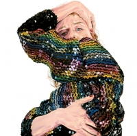
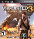
Really excellent, minimal yet striking; conveys a sense of isolation, panic and doom.
It's got to be one my all time favorites, simply wow!


The one thing I don't like about it is all the logos on bottom. Besides that it is perfect! :D

Sig thanks to Saber! :D
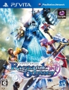
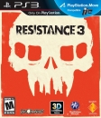
| ocean-1984 said: EU one looks better, small Move info, insomniac logo blended in, psn logo on top.
|
damn...first motorstorm, then infamous..now this! 0_0 you guys are lucky! wish I could import em or buy an imported version here in the US
In-Kat-We-Trust Brigade!
"This world is Merciless, and it's also very beautiful"
For All News/Info related to the PlayStation Vita, Come and join us in the Official PSV Thread!
I'm hyped.
e=mc^2

Gaming on: PS4 Pro, Switch, SNES Mini, Wii U, PC (i5-7400, GTX 1060)
That is... weird

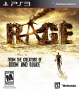
i had to look twise to realize that its teeth resemble the new york skyline lmao
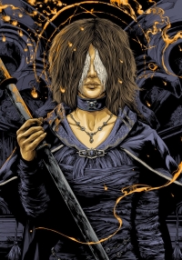
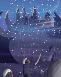
Wery interesting to see the different reactions. Well, as something that is not "the norm" i like it. It also has some mistery to it somehow. and like some said, it's like a poster for the resistance. It's good.

About Us |
Terms of Use |
Privacy Policy |
Advertise |
Staff |
Contact
Display As Desktop
Display As Mobile
© 2006-2026 VGChartz Ltd. All rights reserved.
