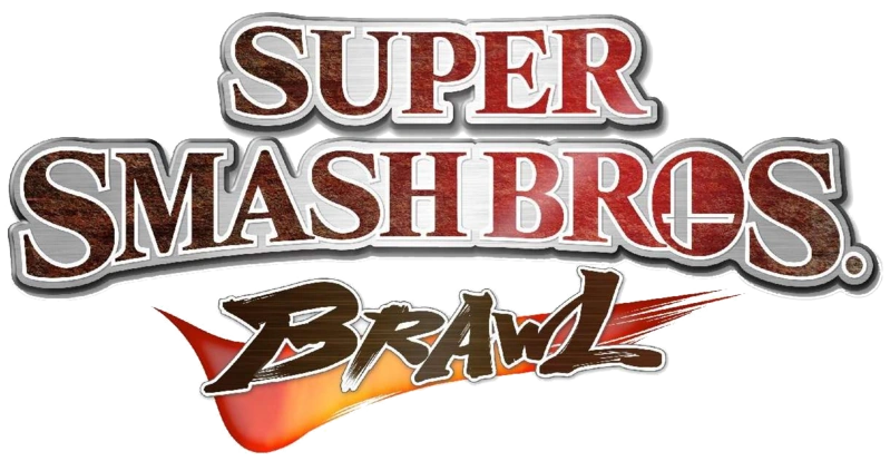
SKMBlake said:
It's the same font used in both versions (Brawl or Wii U). I'm a graphic designer so I can clearly spot the differences. Same font for the Wii and the Wii U version, the only difference is that it's stretched horizontally in the Wii U version, but it's more close to the Brawl logo than the Wii U logo. And the O of Bros is shaped like the Brawl logo.
It doesn't matter if you agree or not, it's just not the same logo. |
I never claimed it was the same logo, just that the wordmark has more similarities to the Wii U than the Brawl one. Regardless of whether that's due to a different font or stretching the same font in different places, my point is that it's not a drastically different logo.
And besides, whether it's based more heavily off the Brawl or Wii U logo is pretty irrelevant regardless. A slightly altered logo does not a new game make; see Hyrule Warriors Wii U to Hyrule Warriors Legends.


