Skullwaker on 14 January 2015
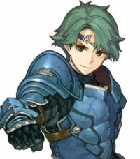
Update: I'm quite liking this now. The first look was a bit iffy for me, but I think it accurately portrays the tone of the game and I really like that the ink is near the logo at the top. There are a few things that I would personally change, like the abundance of blue/orange (I think I would've gone with some more pink/green to even things out, but I see why they didn't do that) but other than that, it's great!
For some reason, I'm really into box art. I like game covers to look as cool as the games themselves. Though it hardly has an effect on how good the game actually is, lol.