









S.Peelman on 11 December 2014
In Europe they've been inconsistent since forever. We've either had the Japanese box or the US's, and sometimes in ye olden days we'd have our own original one.
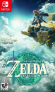
Speaking for Zelda, I usually think the golden arts are better, because somehow I feel the color fits the franchise. I for instance like the golden A Link Between Worlds better than the green one, but must say Wind Waker HD is better in it's colored version (which we got in Europe). It seems in Europe at least we'll get a primarily purple-colored style on Majora's Mask's box. I'm curious to see what they'll do with the American art. Also, I hope they put a reverse image on there, preferably the same one, without the age logos. Those things just ruin it.


