
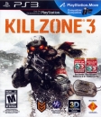
osamanobama on 18 May 2011


^^^^^^^^^wayyyyy better


^^^^^^^^^wayyyyy better

| osamanobama said:
^^^^^^^^^wayyyyy better |
Maybe in 2006. But today a game with that Resistance 1 box art wont stand out at all. There are dozens of games with same exact visual message on the box.
New box art however is like Tarantino movies...not conventional, or even pretty...yet the more you look at it the more you like it.
| osamanobama said:
^^^^^^^^^wayyyyy better |
Okay, I forgot quite how epic R:FoM's boxart is (somehow, even though the game is sitting in my basement ha). You have a point. So my opinion is: R:FoM>>R3>>R2. But R3's continues to grow on me - well, if they choose the one with Capelli in it that is.

Thank me later Sony :D
| Seece said: I'm aware it'd odd me posting this, but I am because it's already one of my fav box arts this gen!!! |
Despite not telling us anything or giving us any kind of idea about the game?


pizzahut451 said:
|
Doesn't need to tell me anything .. I'm going by the image.

Urgh, do the "only on playstation", "move compatible" , "3D compatible", and "playstation network" logos all need to be there, or be as big?
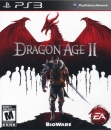
I like the "only on playstation logo", it has a nice style to it, but the "move compatible" logo found on the US box-arts are absolutely horrible.
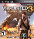
I will probably get the EU version of this game:

| Seece said: I'm aware it'd odd me posting this, but I am because it's already one of my fav box arts this gen!!! |
yea odd but not surprising! well atlease not to me.
i agree its deff cool
| VXIII said:
Thank me later Sony :D |
meesa like.
that is really good
SOny do it
About Us |
Terms of Use |
Privacy Policy |
Advertise |
Staff |
Contact
Display As Desktop
Display As Mobile
© 2006-2024 VGChartz Ltd. All rights reserved.