After a long hiatus I decided to try ressurect this, although it took a little more effort to get the data now that the monthly charts are missing. I will also try keep records for each timestamp I do this for. For now here is the data until the end of August. Please discuss :)
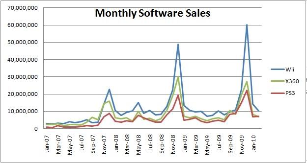
First up Monthly Software Sales:

followed by monthly Hardware sales:

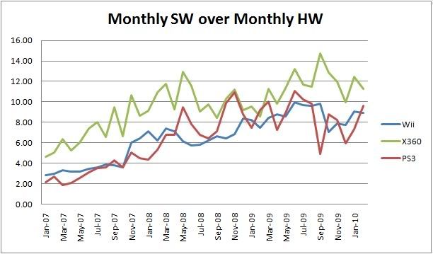
Now we start to look at attach rate, to start with a graph which provides no real information Monthly SW over Monthly HW sales:

What this graph shows us is as we expected software sales are increasing faster than hardware sales.
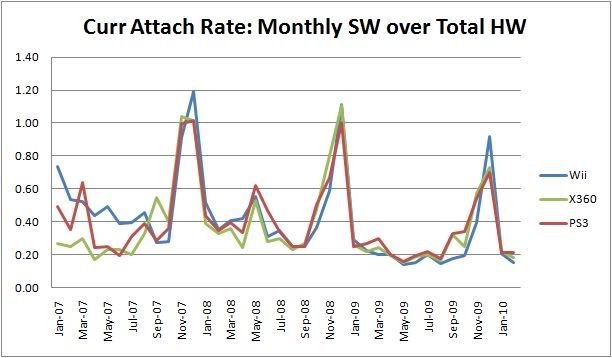
Now onto more interesting graphs, the current attach rate, that is monthly sales over total hardware. This gives us an indication of how software is selling to the existing user base:

Here we see that except for the inital start the three consoles actually follow very similiar sales patterns with an almost identical current attachment ratio

UPDATE: updated till end of August


