
tedsteriscool on 04 September 2009
Post your XMB screens here (just don't overload the thread with pure sexyness!).
I think it looks uber hawt since 3.00.
A pic of mine tonight:


Post your XMB screens here (just don't overload the thread with pure sexyness!).
I think it looks uber hawt since 3.00.
A pic of mine tonight:
_161_large.jpg)
Its so gay... I like it.

You'd be surprised with how many people think just the opposite.


It's fine. To me the changes seem minimal (havven't tried a dynamic theme yet) and I remain amazed how people see a huge difference because there's a tiny new dialogue (a useful one admittedly) on the main screen and some icons/fonts have changed.
Where did the sparkles come from though?
Try to be reasonable... its easier than you think...
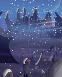


I prefer the stylish airpaint icons though, previously I used a blue gradient, but with the cool sparkles (a still screenshot doesn't do justice) and cyan airpaint icons it feels to me a purple gradient background suits it better. I'm very happy with the looks. 
I tried the free Afrika dynamic theme, nice if not I'm for the icon colors being very wrong. Very hard to make out the icons. The LittleBigPlanet theme seems much cooler, but I haven't bought it as I'm very happy with as is.


It'd frikin huge man, I hate it.


The icons are kind of big which is a good and bad thing if ya know what i mean.
But the new sprak-tastic backround pwnds the old stale one from befoe, it gives the backround a more magical feeling to it.


I think the icons can be dolled up a bit, they look rather plain.
Cosmetically the rest is alright IMO.
About Us |
Terms of Use |
Privacy Policy |
Advertise |
Staff |
Contact
Display As Desktop
Display As Mobile
© 2006-2026 VGChartz Ltd. All rights reserved.
