So... A box art now decides which version of the game will be most successful (looking at some people's comments)?
All I can say about it is this: It feels zombi-ish with the green color, which is good. They also got four fingers up, which represents the 4-player coop feature, cool. It has the Valve logo on the bottom right corner, nice. So, they pretty much got the concept!
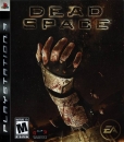
I mean, can it be worse than this (it doesn't even make any sense, by the way):

?
(sorry for raping this thread with this horrible box art)


