
Entroper on 09 February 2007
...is this image not scaled properly?
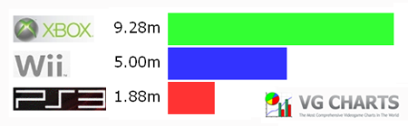 4.50m is more than 50% of 8.91m, but the blue bar is CLEARLY less than half as long as the green bar. I think the red bar is too short too, but it's harder to tell.
If you go here: http://www.vgcharts.org/ngwars.php the table at the top looks correctly proportioned. But the sig image is definitely off.
4.50m is more than 50% of 8.91m, but the blue bar is CLEARLY less than half as long as the green bar. I think the red bar is too short too, but it's harder to tell.
If you go here: http://www.vgcharts.org/ngwars.php the table at the top looks correctly proportioned. But the sig image is definitely off.