By using this site, you agree to our Privacy Policy and our Terms of Use. Close

Forums - Nintendo - Nintendo Switch Boxart

guiduc said:

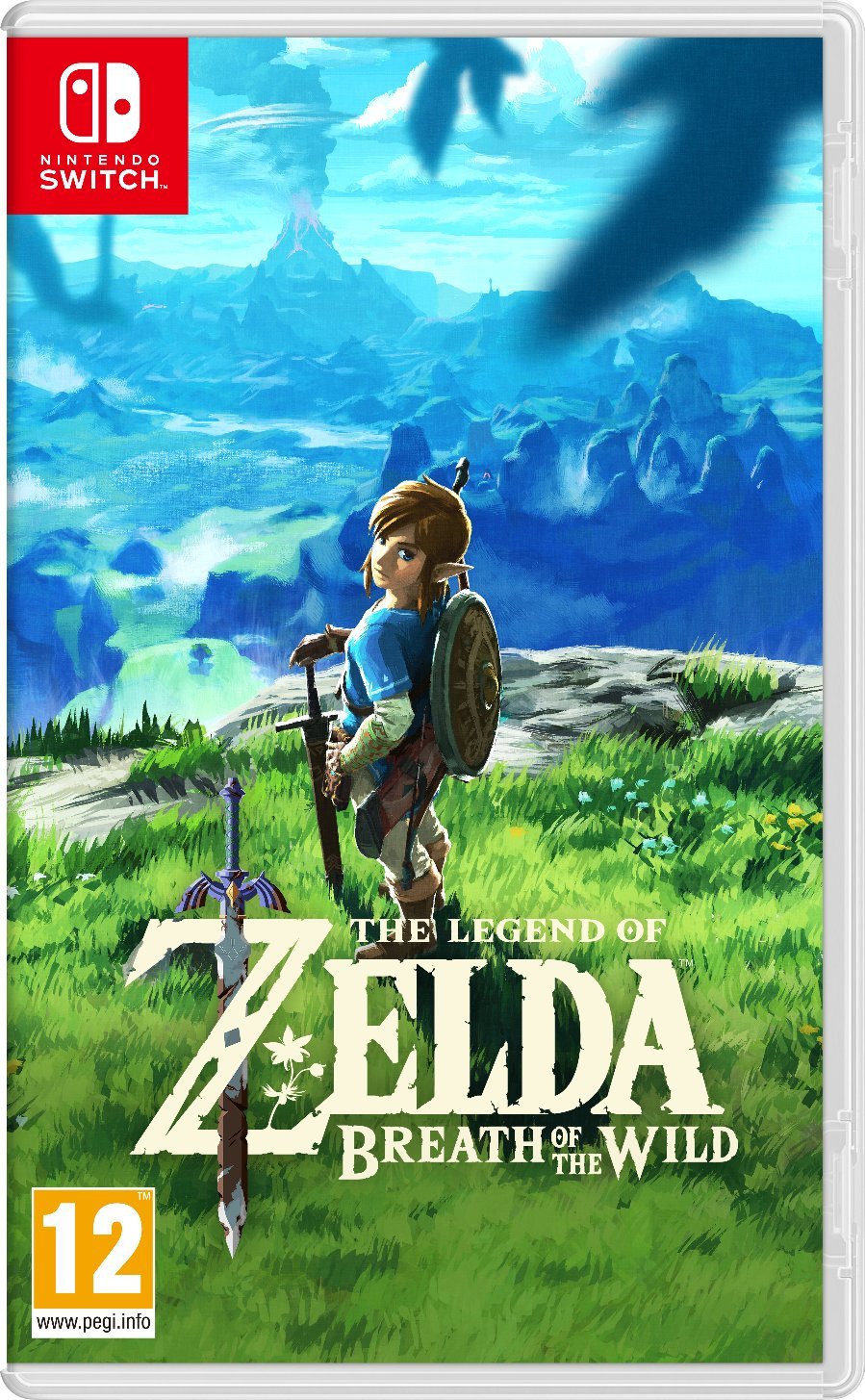
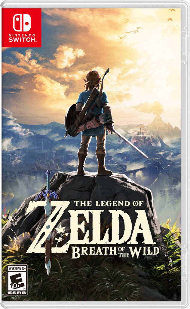
Zelda boxart. Damn format annoys me.


I love it!


Proud to be the first cool Nintendo fan ever

Number ONE Zelda fan in the Universe

DKCTF didn't move consoles

Prediction: No Zelda HD for Wii U, quietly moved to the succesor

Predictions for Nintendo NX and Mobile


Around the Network
Bristow9091 said:
Am I the only one that despises the red square in the corner? It just looks so obtrusive... I've had preferred a bar along the top or down the side, at least then we don't have a lovely picture (Zelda for example) with a corner cut off...

It works because of the NS branding (Red is necessary and the logo is square-shaped). From  a design standpoint it's very sleek actually, this way we get a full art cover instead of something like this.


Bristow9091 said:

But who says it'd have to be that thick anyway?

It kinda has to be that way, otherwise the logo would be too small and have tons of wasted space wherever it's placed.


Bristow9091 said:
gatito said:

It kinda has to be that way, otherwise the logo would be too small and have tons of wasted space wherever it's placed.

Put the words "Nintendo Switch" beside the logo instead of under it?

Yeah but that arrangement doesn't seem to be part of the Nintendo Switch branding which have to follow a certain set of very strict rules. Some logos have both horizontal and vertical orientation, this one doesn't seem to be like that.


Woah, these are pretty nice. They seem like PSP boxes.


Dance my pretties!

The Official Art Thread      -      The Official Manga Thread      -      The Official Starbound Thread

Around the Network

I like the logo taking up less space allowing focus on box art. Zelda in particular looks great.


Dragon Quest Heroes I&II


Bristow9091 said:

I've just noticed that the box art for Zelda is different in EU/UK to the US, this is from Amazon UK:

This isnt too bad either. Maybe they should have this be the undercover for everywhere else too. The shadows on the top is weird though.


Really liking the emphasis on quality box art that the lack of a huge logo seems to be bringing. All of these look good. Love Zelda and Splatoon's.