mantlepiecek on 09 November 2011
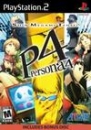
Many games have titles too long and big and sometimes take up the entire banner; for example :
And :
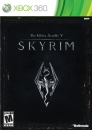
And :
http://gamrreview.vgchartz.com/game/48615/lego-pirates-of-the-caribbean-the-video-game/
The "Read the review" above the title doesn't help either =/.
And what's the point of having "read the review" on the banner when there is a review "box" linked image under the banner on the home page. There is also a review drop down menu from which one can select "gamrreview review" as well.
Still, the read the review is better than the entire title on the banner.
I am not sure if these changes were going to be included in the next update, so I thought of sharing my thoughts.