


makingmusic476 on 18 May 2011
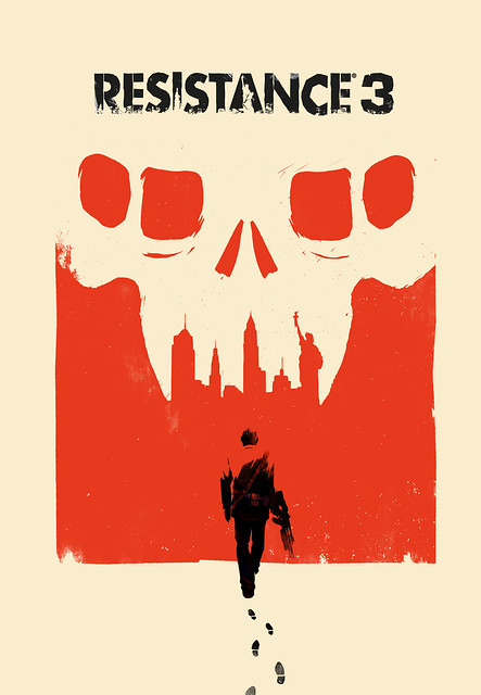
A bit orange for my tastes (loathe that color), but aside from that I really like it. It reminds me of the Helghan propaganda art from Killzone.
It'd been nice if they could've fit Capelli from the alternate art onto the cover:


_161_large.jpg)


