makingmusic476 said:
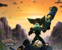
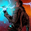
cover has me hyped. More grim and grey, less bright and orange like Resistance 2. Looking back at old concept art, Resistance 2 had a very colorful, "omg alienz!" vibe to it. R3 has more of the end of the world, horror-esque feel that Fall of Man had.
Now they just need to come up with a cover as equally awesome as Fall of Man's cover. Resistance 2's cover was too "look, bald space marine!" for me. But I suppose that was more a fault of Sony's inept marketing at the time than anything Insomniac might've done. Sony was very into the generic "close up of pro/antagonist on cover" stuff at the time.
Also, yeeeaaah new info on the Last Guardian! Hopefully it's not just a retread of TGS stuff.
|
I agree. (Happy, Kantor!?  ) While I do enjoy R2, one of the great things about the first game was the atmosphere (and weapon wheel). I loved the grey, bleak look. It fit the game very well. Seeing it (and the weapon wheel) go in R2 was rather sad. (And the health bar. I wants it back.) The picture looks much more like the first game, and I have very high hopes for R3. Especially if they keep the co-op from R2 and toss in some campaign co-op as well.
And I agree with your second part. The cover for the first game was much better than that of R2.


