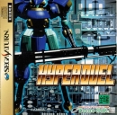
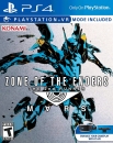
| -Adonis- said: Move your ass Sony, faster and do this : |
This image suffers from one of the main problems with the first game. No cohesive art style. Too many clashing looks. This is something Smash perfected is no matter the character or game series. Smash creates a cohesive art style. You have to do the same for any fighting game. I know it's fan-made but still, it just shows why this would not work.
Bite my shiny metal cockpit!


