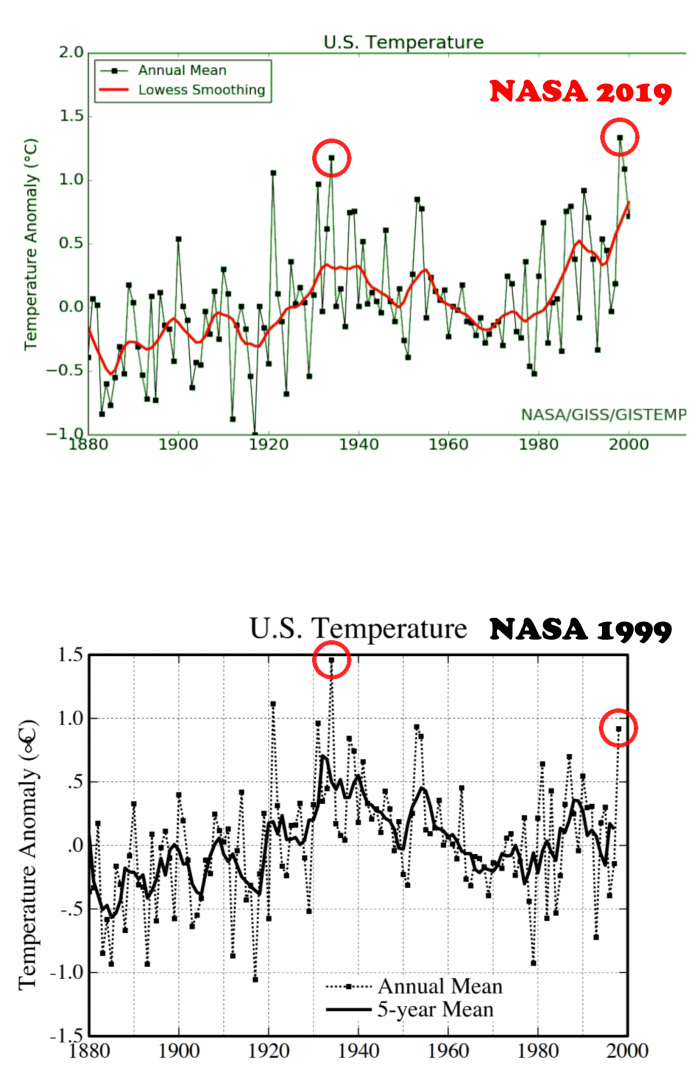
NASA 1999 vs 2019. Cooling past temperatures (in particular the 1930s) to create a "warming trend"

The 1999 graph in detail: 1930s were much warmer then the year 2000 and we can see the "New Ice Age" decline from ca. 1940 to 1980. The modern hockey stick figures just add a linear trend to the data to create near continuous warming.
https://www.giss.nasa.gov/research/briefs/hansen_07/
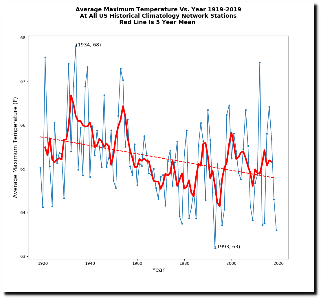
The unaltered data. We have a recovery from the "New Ice Age" but are still way below the extremes of the 1930s.


