


I just remembered another thing that's been bothering me for years.
PlayStation's Greatest Hits, Platinum and Essentials re-releases.
It was acceptable on PS1 and PS2 (mostly grey) but terrible on PS3 (yellow and red).
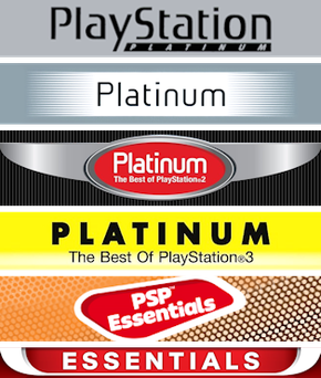

I know it's because they want us to buy the games before they hit the bargain bin but as a collector it's driving me nuts going online and buying what seems to be a game with the original box art only to receive a game with a cover that shits all over the work of the cover artist. Additionally, the color hurts my eyes and it sticks out like a dick on a cake.
It's 1st world problems and I shouldn't care, I know. But if Sony does this again with PS4 re-releases, I hope they make them more subtle. Apart from the grey cases, I think the way Microsoft designed the latest Xbox 360 "Classics" is a much better way to make box art for budget games. Here, I barely notice the difference on my shelf.

In the perfect world, it'd just be an easy to remove sticker.