


More on why I hate flat designs and Windows Phone:
http://sixrevisions.com/user-interface/when-flat-design-falls-flat/
When Flat Design Falls Flat
Flat design is the most popular trend in UI design right now.
Superficially, flat design is simple:
- Don’t use gradients, shadows and textures
- Use simple shapes, bold colors and clear typography
I believe that a few prominent flat designs sacrifice usability and best practices such as consistency for the sake of aesthetics — and this is what I’ll primarily be talking about. But first, I’d like to discuss flat design in a historical context.
Flat Design’s Origin
"A designer knows he has achieved perfection not when there is nothing left to add, but when there is nothing left to take away."
- Antoine de Saint-Exupery
Skeuomorphic Design
Flat design is a reaction to its predecessor, skeuomorphism.
Skeuomorphs are user interfaces designed to look like real-world objects.
For example, the UI below resembles how a real-world audio compressor looks and functions:
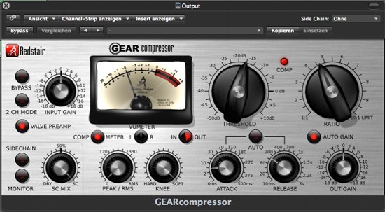 Source: Klaus Göttling
Skeuomorphs started in the 1980s as a way to ease people into computer interfaces.
Up until recently, Apple was skeuomorphism’s biggest champion, embracing the design philosophy in all of the company’s UIs and guidelines.
For instance, the old Apple Safari icon is instantly recognizable as a compass — it has shadows, gradients, and fine aesthetic details compared to its flat counterpart:
The Purpose of Flat Design
Flat design as a design approach strips away all the aesthetic frills, leaving behind only the essentials.
In a way, I see flat design as just another name for modernism, defined by a generation of UI designers who grew up with computers and have found skeuomorphism to be unnecessary.
No more gradients, drop shadows, and textures. Just beautiful typography, simple icons and shapes, vibrant colors to help establish visual hierarchies, and, most importantly, a deeper attentiveness on ease-of-use.
Flat design is driven by a desire for a more efficient and user-friendly interface.
That’s the idyllic purpose of flat design, but the current reality is so disconnected from it.
Issues with Flat Design
While there are plenty of great examples of flat design, there are also plenty of bad ones.
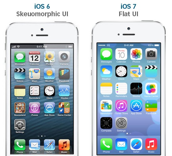
iOS 7′s UI Inconsistencies
Before the mobile operating system’s debut, rumors flew around: With new leadership from Jonathan Ive, iOS 7 was finally going to ditch skeuomorphic design and go flat.
And it did.
Take a look at the comparison below when iOS 7 was first announced:
 Source: designmodo.com
Skeuomorphic elements are gone. No more highly-stylized icons and faux wood trim.
What’s wrong with iOS 7?
It’s inconsistent.
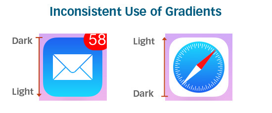
The icons look glaringly out-of-place, as if they were designed by different teams (andthey probably were).
Some icons have gradients. Other icons don’t.
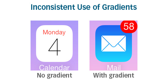
Of the icons that do have gradients, sometimes the gradients go in different directions:
Line thicknesses vary.
Symbolic representations of some icons are oversimplified and are sometimes meaningless. The Game Center icon, for example, is a group of colorful, glassy-looking circles:
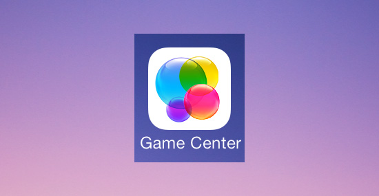
What does the Game Center icon mean? How does it relate to gaming? If there was a symbolic meaning behind the icon, it’s too obscure for most people to know, thus making it a poor metaphor.
Other symbolic representations are overdone. The Newsstand icon, for example, is too complex and fine-detailed compared to its neighbors:
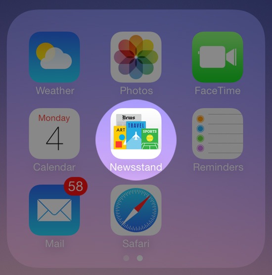
Consistency is crucial in creating a user-friendly design. Flat or not.
Usability Issues That Come From Being "Too Flat"
Okay, so no gradients, no textures, no drop shadows.
Keep things consistent.
And try to make it look modern.
That’s it? Piece of cake.
But there’s more to it than that.
Like any good UI, a good flat design should make usability the topmost priority.
Flat design aesthetics need to go hand-in-hand with usability. And if a decision had to be made between aesthetics and user-friendliness, the latter should be prioritized over the former.
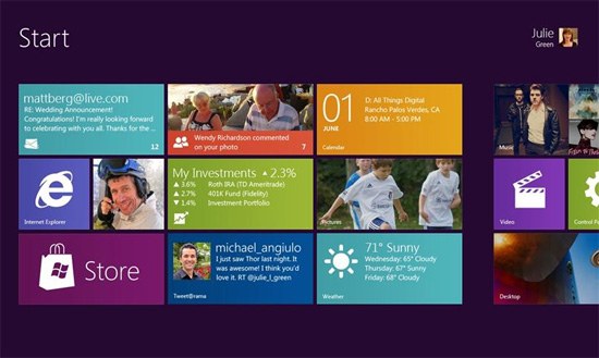
Functionality has been neglected in some UIs that have adopted a flat design. Take Windows 8 for instance:
 Source: mobiletechworld.com
Window 8′s UI is radically flat. Its brave use of bold colors and tiled Modern UI design are fresh, positive steps for the Windows brand.
But its main issue is usability.
With Windows 8, Microsoft tried to apply a tablet experience onto a desktop.
It didn’t work.
Window’s flat Modern UI (formerly known as Metro UI) is not intuitive for someone using a keyboard and mouse. According to Soluto’s Monthly Insights Report, between44-60% of all Windows 8 users (desktop and tablet) are opting for the old interface over the Modern UI option.
Though flat design is supposed to make things easier, many people still find the old interface more user-friendly.
Jakob Nielsen ran usability tests on Windows 8 and noted several issues with its UI. The main issue Nielsen found was how the operating system’s flat design made it hard for users to know if things are clickable or not.
 Source: nngroup.com
While the new Windows 8 icons are elegant and clean, they don’t appear actionable. Without a gradient, shadow, or just something that makes them distinctive, it’s hard to tell what’s clickable and what’s not.
Flat design can sometimes be so flat that it hurts usability.
If a user interface is "too flat", actionable elements can be lost in a sea of flat elements that all look the same.
There are even some concerns with iOS 7′s Control Center being "too flat":
Without any good visual hints, it’s not obvious which objects you can interface with.
Solution: Almost-Flat Design?
So how do you remedy issues with flat design? Almost-flat design.
Almost-flat design is an approach that chooses flatness only when it improves usability. It doesn’t categorically say or imply that gradients and drop shadows are evil.
Almost-flat design permits subtle shadows and gradients to create dimension, distinction, visual hierarchies, visual cues, and boundaries.
Gmail’s Almost-Flat Design
Clean and consistent, Gmail’s recent UI redesign is easy on the eyes. It’s clear that Google’s designers love flat design — they’ve been moving towards flatter and flatter UIs as of late.
 Source: idownloadblog.com
However, hover your mouse over a button, and you’ll see the hover state has a slightly different color gradient as well as a useful tooltip:

These subtle aesthetic effects give users visual cues that the object is important and that it is actionable.
Users instantly recognize buttons in Gmail as clickable or tappable without the need for over-the-top embellishments ala skeuomorphism.
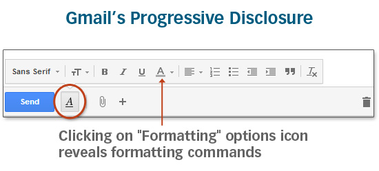
Crucial interface elements are easily accessible. There’s no need for twenty buttons to be visible at once because Gmail’s UI employs progressive disclosure intelligently:
The Future for Flat
Gmail’s interface is exactly what flat design is supposed to be:
- User-friendly
- Consistent
- Clear
iOS 7′s and Windows 8′s versions of flat design often sacrifice usability and well-established design best practices for flatness.
To be fair, both Apple and Microsoft are listening to criticism.
Before iOS 7′s release, Apple addressed some usability issues such as updating theslide to unlock function with an arrow pointing to the right to gives users a better visual cue, and they have tweaked the color gradients for the Safari and Mail icons so the operating system’s app icons are more cohesive.
And Microsoft just released Windows 8.1 which will allow users to bypass the Modern UI interface entirely, going straight to the desktop version instead.
Ultimately, good design — whether it’s flat or not — should aim to address problems for its users through clear visual communication, efficient design, and user-friendliness.
http://alittlecode.com/hyperflat-design-is-not-great-web-design/
Hyperflat Design is not great Web Design
The trend away from skeuomorphic design toward flat design has in many ways been refreshing and enjoyable. And yet, it’s worth noting that flat can be taken too far, to the detriment of usability. Take for example Microsoft’s modern.ie site – see the commented screenshot below orcheck it out yourself.
 An example of Microsoft taking flat design too far. Usability cues have gone missing.
I would argue they’ve taken interface design hyperflat, and in so doing have left users without important usability hints.
Yes, the gradients and shadows of yesterday have often been overdone. But there is such a thing as subtlety and sophistication, without complete abdication. Used well, gradients, shadows, and hover effects give users important visual cues for navigating your website’s interface more efficiently and effectively.
 Even in this otherwise “flat” design, shadows convey depth and provide visual cues to users.
In other words, if you’re going to make use of flatness in design, do it while still giving your users the visual cues they need. ThusJohn Gruber has recently written on the topic of flat design:
Letterpress … is a perfect example. It is indeed, mostly flat … But Letterpress does have Z-axis depth: when you drag a letter tile, it pops up and has a drop shadow under it until you place it. There’s nothing “flat” about that. What Letterpress rejects is not depth, but depth as mere decoration. The visual “raising” of a tile as you play it is a natural visual cue, a way of emphasizing what it is you’re moving.
Visual cues are the key here.
Count me in favor of what Matthew Moore has called “almost flat design.” At times Apple has taken its skeuomorphic usability enhancements too far. But Microsoft’s position is worse. I think Moore is right — Google’s interface design gets it just about right.
 Google’s use of edges, bevels, shadows and hover effects, while not overdone, give users important usability cues.
Of course there are other examples. One I’ve recently enjoyed is Andy Clarke’s recent Stuff & Nonsense redesign. Check out his homepage, and you’ll see some elements that are flat, some with edges, some with shadows. All links and buttons have hover effects, begging to be clicked. Then there’s that one gorgeous button, darn near unavoidable in its lusciousness. (No Skitch arrows needed.)
 Some flat, some edges, some shadow, all buttons and links with hover effects. And one unavoidably gorgeous button!
What’s going on here? Is it flat or not? With the times? Or behind? One could be forgiven for suspecting that Clarke has subordinated such questions and privileged the point and purpose of the communicative task at hand. While obviously interacting with current trends, the design is enslaved to none of them. Rather it brings past, recent, and current conventions together under the auspices of time-tested and user-empowering design strategies, including visual affordances, interactive feedback, and visual hierarchy.
Clear, straightforward, expressive, and inviting, the design speaks a visual language that is easy to understand and navigate — it looks great to boot — and it leaves no uncertainty about the most important action items on the page.
For my money, that’s great web design.
http://www.nngroup.com/articles/windows-8-disappointing-usability/
Windows 8 — Disappointing Usability for Both Novice and Power Users
Summary: Hidden features, reduced discoverability, cognitive overhead from dual environments, and reduced power from a single-window UI and low information density. Too bad.
With the recent launch of Windows 8 and the Surface tablets, Microsoft has reversed its user interface strategy. From a traditional Gates-driven GUI style that emphasized powerful commands to the point of featuritis, Microsoft has gone soft and now smothers usability with big colorful tiles while hiding needed features.
The new design is obviously optimized for touchscreen use (where big targets are helpful), but Microsoft is also imposing this style on its traditional PC users because all of Windows 8 is permeated by the tablet sensibility.
How well does this work for real users performing real tasks? To find out, we invited 12 experienced PC users to test Windows 8 on both regular computers and Microsoft's new Surface RT tablets.
Double Desktop = Cognitive Overhead and Added Memory Load
The Roman god Janus; Dr. Jekyll and Mr. Hyde; even Batman's arch-foe Two-Face — human culture is fascinated by duality. We can now add Windows 8 to this list. The product shows two faces to the user: a tablet-oriented Start screen and a PC-oriented desktop screen.
Unfortunately, having two environments on a single device is a prescription for usability problems for several reasons:
- Users have to learn and remember where to go for which features.
- When running web browsers in both device areas, users will only see (and be reminded of) a subset of their open web pages at any given time.
- Switching between environments increases the interaction cost of using multiple features.
- The two environments work differently, making for an inconsistent user experience.
Lack of Multiple Windows = Memory Overload for Complex Tasks
One of the worst aspects of Windows 8 for power users is that the product's very name has become a misnomer. "Windows" no longer supports multiple windows on the screen. Win8 does have an option to temporarily show a second area in a small part of the screen, but none of our test users were able to make this work. Also, the main UI restricts users to a single window, so the product ought to be renamed " Microsoft Window."
The single-window strategy works well on tablets and is required on a small phone screen. But with a big monitor and dozens of applications and websites running simultaneously, a high-end PC user definitely benefits from the ability to see multiple windows at the same time. Indeed, the most important web use cases involve collecting, comparing, and choosing among several web pages, and such tasks are much easier with several windows when you have the screen space to see many things at once.
When users can't view several windows simultaneously, they must keep information from one window in short-term memory while they activate another window. This is problematic for two reasons. First, human short-term memory is notoriously weak, and second, the very task of having to manipulate a window—instead of simply glancing at one that's already open—further taxes the user's cognitive resources.
Flat Style Reduces Discoverability
The Windows 8 UI is completely flat in what used to be called the "Metro" style and is now called the "Modern UI." There's no pseudo-3D or lighting model to cast subtle shadows that indicate what's clickable (because it looks raised above the rest) or where you can type (because it looks indented below the page surface).
I do think Metro/Modern has more elegant typography than past UI styles and that the brightly colored tiles feel fresh.
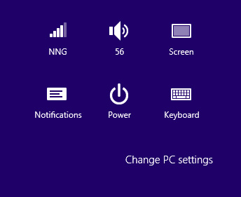
But the new look sacrifices usability on the altar of looking different than traditional GUIs. There's a reason GUI designers used to make objects look more detailed and actionable than they do in the Metro design. As an example, look at this settings menu:

The bottom of the Windows 8 settings menu on Surface RT.
Where can you click? Everything looks flat, and in fact "Change PC settings" looks more like the label for the icon group than a clickable command. As a result, many users in our testing didn't click this command when they were trying to access one of the features it hides.
(In that task, we asked users to change the start screen background color. As a further problem, the very command label had misleading information scent for some users; they thought of the Surface as a tablet, not a "PC.")
We also saw problems with users overlooking or misinterpreting tabbed GUI components because of the low distinctiveness of the tab selection and the poor perceived affordance of the very concept of clickable tabs.
Icons are flat, monochromatic, and coarsely simplified. This is no doubt a retort to Apple's overly tangible, colorful, and extremely detailed "skeuomorphic" design style in iOS prior to iOS 7. For once, I think a compromise would be better than either extreme. In this case, we often saw users either not relating to the icons or simply not understanding them. (Update: unfortunately Apple repeated many of Microsoft's mistakes in iOS 7.)
Icons are supposed to (a) help users interpret the system, and (b) attract clicks. Not the Win8 icons.
Low Information Density
The available advice on designing for the "modern UI style" seems to guide designers to create applications with extraordinarily low information density. See, for example, the following screenshots:

Start screens from the Bing Finance (top) and Los Angeles Times (bottom) apps for the Surface tablet.
Despite running on a huge 10.6-inch tablet, Bing Finance shows only a single story (plus 3 stock market quotes) on the initial screen. The Los Angeles Times is not much better: this newspaper app's initial screen is limited to 3 headlines and an advertisement. In fact, they don't even show the lead story's full headline and the summary has room for only 7 words. Come on, this tiny amount of news is all you can fit into 1366 × 768 pixels?

www.latimes.com in the tablet-mode browser.
Visiting the newspaper's website in Internet Explorer gives you much more information, though it's unfortunate that the site doesn't exploit the real estate offered by the widescreen aspect ratio on the Surface (and many full-sized computers). The website shows 9 stories (and 3 ads) in the same space as the 3 stories offered by the Metro app. Plus we get full summaries of the top articles.
Yes, big photos are nice. Yes, spacious layouts are nice. But you don't have to be a fanatic follower of Edward Tufte to want a bit more "data ink" on the screen.
As a result of the Surface's incredibly low information density, users are relegated to incessant scrolling to get even a modest overview of the available information.
As it turns out, users didn't mind horizontal scrolling on the Surface, which is interesting given that horizontal scrolling is a usability disaster for websites on desktop computers. Still, there's such a thing as too much scrolling, and users won't spend the time to move through large masses of low-density information.
Overly Live Tiles Backfire
Live tiles are one of the UI advances in Windows 8. Instead of always representing an app with the same static icon, a live tile summarizes current information from within the app. This works well when used judiciously. Good examples include:
- Weather app showing current (or predicted) temperature and precipitation
- Email app showing the subject line of the latest incoming message
- Calendar app showing your next appointment
- Stock market app showing the current market level
Unfortunately, application designers immediately went overboard and went from live tiles to hyper-energized ones. To illustrate …
Quick, without reading the caption, which apps do the following 4 tiles represent?

Live tiles for (clockwise from upper left): Urbanspoon, Los Angeles Times , Newegg, and Epicurious.
Newegg is the only app that includes its full name in the tile. When we asked participants to use the other apps, they couldn't find them. This on a new tablet with only a few applications installed. We know from our user testing of other tablets and mobile devices that users quickly accumulate numerous applications, most of which they rarely use and can barely recognize—even with static icons that never change. (Which is why we spend time on launch icon design in the course on Visual Design for Mobile and Tablet.)
The theory, no doubt, is to attract users by constantly previewing new photos and other interesting content within the tiles. But the result makes the Surface start screen into an incessantly blinking, unruly environment that feels like dozens of carnival barkers yelling at you simultaneously.
Charms Are Hidden Generic Commands
One of the most promising design ideas in Windows 8 is the enhanced use of generic commands in the form of the so-called "charms." The charms are a panel of icons that slide in from the screen's right side after a flicking gesture from its right edge (on a tablet) or after pointing the mouse to the screen's upper-right corner (on a computer).
The charms panel includes features like Search , Share (including email), and Settings that apply to whatever content the user is currently viewing. In principle, it's great to have these commands universally available in a single, uniform design that's always accessed the same way.
In practice, the charms work poorly — at least for new users. The old saying, out of sight, out of mind, turned out to be accurate. Because the charms are hidden, our users often forgot to summon them, even when they needed them. In applications such as Epicurious, which included a visible reminder of the search feature, users turned to search much more frequently.
Hiding commands and other GUI chrome makes sense on small mobile phones. It makes less sense on bigger tablet screens. And it makes no sense at all on huge PC screens.
Furthermore, the charms don't actually work universally because they're not true generic commands. In our test, users often clicked Search only to be told, "This application cannot be searched." Enough disappointments and users will stop trying a feature. (Also, of course, it violates basic usability guidelines; that is, you shouldn't tease users by offering a feature that isn't actually available.)
Finally, not all users understood that the commands are context dependent and do different things on different pages.
Many other features are initially hidden and are revealed only when users perform specific and often convoluted gestures. For example, all of our users had great difficulty with an extraordinarily basic task: changing the city in the weather app. Obvious gestures, such as clicking the name of the current city to change locations, didn't work. Users' difficulties were exacerbated by the fact that the "Modern" GUI style doesn't indicate which words and fields are active and/or can be changed.
What's the long-term usability of the hidden features in Windows 8? We might expect users to grow accustomed to the need to reveal the charms and other non-visible commands, even though this imposes additional cognitive overhead on using the system. That is, people must think to do something, rather than being reminded to do something, and thus users will sometimes neglect useful Win8 features.
Also, the familiarity bred by long-term use might be counteracted by the fact that well-designed websites have trained users to expect important features to be shown directly in the context in which they're needed. You simply can't design a website with hidden features and expect it to be used: website features are usually ephemeral, meaning that they must be explicitly represented if they're to gather any use.
Thus, people's experience with the web excerts a powerful pull in the direction of expecting visible features. It remains to be seen whether the Surface tablet's physical presence creates enough of an opposing pull to remind people to look for hidden features when they're using Surface apps.
Error-Prone Gestures
The tablet version of Windows 8 introduces a bunch of complicated gestures that are easy to get wrong and thus dramatically reduce the UI's learnability. If something doesn't work, users don't know whether they did the gesture wrong, the gesture doesn't work in the current context, or they need to do a different gesture entirely. This makes it hard to learn and remember the gestures. And it makes actual use highly error-prone and more time-consuming than necessary.
The worst gesture might be the one to reveal the list of currently running applications: you need to first swipe from the screen's left edge, and then immediately reverse direction and do a small swipe the other way, and finally make a 90-degree turn to move your finger to a thumbnail of the desired application. The slightest mistake in any of these steps gives you a different result.
The UI is littered with swipe ambiguity, where similar (or identical) gestures have different outcomes depending on subtle details in how they're activated or executed. For example, start swiping from the right to the left and you will either scroll the screen horizontally or reveal the charm bar, depending on exactly where your finger first touched the screen. This was very confusing to the users in our study.
Windows 8 UX: Weak on Tablets, Terrible for PCs
As mentioned in the introduction, Windows 8 encompasses two UI styles within one product. Windows 8 on mobile devices and tablets is akin to Dr. Jekyll: a tortured soul hoping for redemption. On a regular PC, Windows 8 is Mr. Hyde: a monster that terrorizes poor office workers and strangles their productivity.
Although Win8 has usability issues on tablets, there's nothing that a modest redesign can't fix. In fact, usability could be substantially improved by revising the application guidelines to emphasize restrained use of active tiles, higher information density, better visibility of key features, and many other usability guidelines we've alreadydiscovered in testing other tablets.
(I was stunned to see the Architectural Digest app for Surface replicate a host of well-documented usability bloopers, such as not making the cover headlines clickable. Swipe ambiguity ran rampant, and users were often lost in this app's confusing combination of vertical and horizontal scrolling. All of this could have been avoided by reading reports we have published for free . I can just barely understand companies that ruin their user experience because they don't want to pay $298 to find out what the usability research says. But to create a bad app to save no money seems a puzzle.)
I have great hopes for Windows 9 on mobile and tablets. Just as Windows 7 was "Vista Done Right," it's quite likely that the touchscreen version of Windows 9 will be "Windows 8 Done Right."
The situation is much worse on regular PCs, particularly for knowledge workers doing productivity tasks in the office. This used to be Microsoft's core audience, and it has now thrown the old customer base under the bus by designing an operating system that removes a powerful PC's benefits in order to work better on smaller devices.
The underlying problem is the idea of recycling a single software UI for two very different classes of hardware devices. It would have been much better to have two different designs: one for mobile and tablets, and one for the PC.
I understand why Microsoft likes the marketing message of "One Windows, Everywhere." But this strategy is wrong for users.
I Don't Hate Microsoft
Because this column is very critical of Microsoft's main product, some people will no doubt accuse me of being an Apple fanboy or a Microsoft hater. I'm neither. I switched from Macintosh to Windows many years ago and have been very pleased with Windows 7.
I am a great fan of the dramatic "ribbon" redesign of Office (we later gave several awards to other applications that adapted this UI innovation), and I proclaimed the Kinect an "exciting advance in UI technology." I have many friends who work at Microsoft and know that it has many very talented usability researchers and UI designers on staff.
I have nothing against Microsoft. I happen to think that Windows 7 is a good product and that Windows 8 is a misguided one. I derived these conclusions from first principles of human–computer interaction theory and from watching users in our new research. One doesn't have to hate or love a company in order to analyze its UI designs.
I'll stay with Win7 the next few years and hope for better times with Windows 9. One great thing about Microsoft is that they do have a history of correcting their mistakes.
http://www.nngroup.com/articles/ios-7/
Summary: Flat design hides calls to action, and swiping around the edges can interfere with carousels and scrolling.
iOS 7, Apple’s operating system for their tablets and mobile devices, moves away from the skeuomorphic design that characterized earlier versions of iOS. The new look is drastically different from the previous operating-system iterations and it boldly parts with some of the conventions that Apple had worked hard to establish over the past 8 years. But is the new design really better? Whether you like the new look or not, some of the new features are welcome usability improvements, whereas others are likely to cause pain.
Buttons and Flat Design
Let’s start with the elephant in the room: the flat design. What makes iOS 7 look so different from its previous incarnations is the decision to move the chrome into the backstage and leave the spotlight to the content. While this decision reflects the well-publicized mobile precept that says to prioritize content over chrome, it can also cause confusion.
Buttons and interface widgets, when present, need to be easily distinguishable from content. They need to have good affordances that invite users to action. In the absence of strong signifiers, they can get ignored, and users may find themselves lost and disoriented.
Flat design is by no means Apple’s invention. In fact, if anything, it seems to be quite fashionable in the mobile world, with Android and especially Windows 8 toying with it at variable extent. Back in 2012, when Windows 8 came around, we noted that users had difficulty distinguishing content from chrome: people missed important buttons on the screen because they looked too much like plain text.
That being said, flat design is not necessarily hopeless. 3D is just one of the many cues that can invite users to tap. Other cues are shadows, coloring the links differently (as on the web), or even the placement of those links on the page.
So far, in Apple’s apps, these cues do a good enough job of signaling tappability. Many of the apps that we’ve seen so far are decent; there are clear differences between what can be pressed and what cannot. Some of the cues rely on users’ previous knowledge of iOS and the web.
For instance, when configuring an email account on the Mail page under Settings, there are several tappability cues:
- Blue color in the navigation bar (<Mail in the top left corner) – this takes advantage of the previous web knowledge (blue is a link on the web) and iOS knowledge (items in the navigation bars are tappable)
- Arrow in a table view (next to Mail Days to Sync) – this also relies on previous iOS knowledge
- Toggle switches that look like sliders that can be moved
- Red color, text centering, and position at the bottom of the page for Delete Account – these are all weaker cues, but they all reinforce each other

As this list shows, even in a single screenshot, the colors used to indicate actionable text can vary. The inconsistency makes this screen harder to use, but worse, it makes other screens harder as well, because it reduces learnability.
When Apple or Google or Microsoft introduce a new look for their mobile operating system, they are also responsible for design guidelines to help app creators replicate that look. Those guidelines should be robust — it shouldn’t be easy to misinterpret them in a way that makes the designs unusable. Unfortunately, flat design is prone to such misinterpretations.
Whether app designers will know how to create the right tap affordances in the absence of proper buttons still remains to be seen. So far it looks like some apps (for instance, The New York Times) are proceeding cautiously, choosing to use borders and other cues to make sure that users know where to tap.
Others, such as Mobile Inspect (an app for used-car dealers) fully embrace the lack of buttons and generate harder-to-use designs:
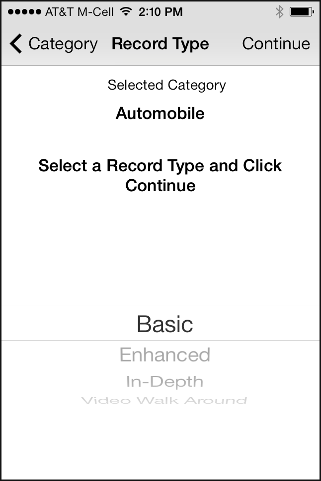
In Mobile Inspect’s design, it’s hard to say what the call to action is and what the user is supposed to do on the page. Of course, if the user reads carefully all the text on the page (which they usually don’t), paying attention to things like verb tense (Selected Category versus Select a Record Type and Click Continue), he will figure it out eventually. But we know from countless hours of testing that people don’t like to think hard, read thoroughly, solve puzzles, and make inferences while using a mobile app: the interaction cost is just too high, and most mobile sessions are short and prone to interruptions.
In Mobile Inspect we can also see the new picker introduced in iOS 7:

The older- iOS picker was already quite impractical — because it only used half the screen, it made a poor choice for long lists:

The new design makes the picker even smaller by using a focus-plus-context visualization (discussed in our course on human-computer interaction): only three items are clearly visible. The others appear distorted and in lighter font; they are harder to read, although perhaps not unreadable. The new picker doesn’t have any clear usability advantages, except for the “cool” design.(Focus-plus-context visualizations usually make sense when an item’s neighbors are usually more relevant than items that are farther away in the same list. For instance, in a calendar, you could imagine that time slots around an event are more relevant to the event than time slots far away. For most dropdowns, the items in the list are equally relevant irrespective of their position in the list.)
Swipe Ambiguity
Swipe ambiguity means that swiping in different places on the screen leads to different results. We first discovered swipe ambiguity when we tested iPad apps that made use of swipe for turning pages. Later on, in its Windows 8 tablets, Microsoft incorporated swipe ambiguity at the operating –system level when it decided to use swiping (1) to expose controls, and (2) for navigation.
iOS 7 has also embraced swipe ambiguity. Swiping near the left, bottom, or upper edges of the screen can cause problems if the swipe is not precisely executed. Let’s talk about each of these swipe gestures.
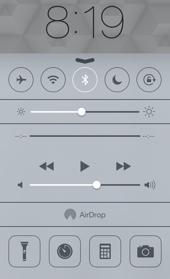
- Bottom edge: Control Center. Swiping on the bottom edge of the screen exposes the Control Center, a place where some frequently used functions of the phone are grouped together. The idea of a quickly accessible Control Center is laudable, since people won’t need to navigate through the iPhone settings to put their phone in airplane mode or turn on the Wi-Fi. However, the placement interferes with a very common gesture on touch screens: scrolling down to see more content.
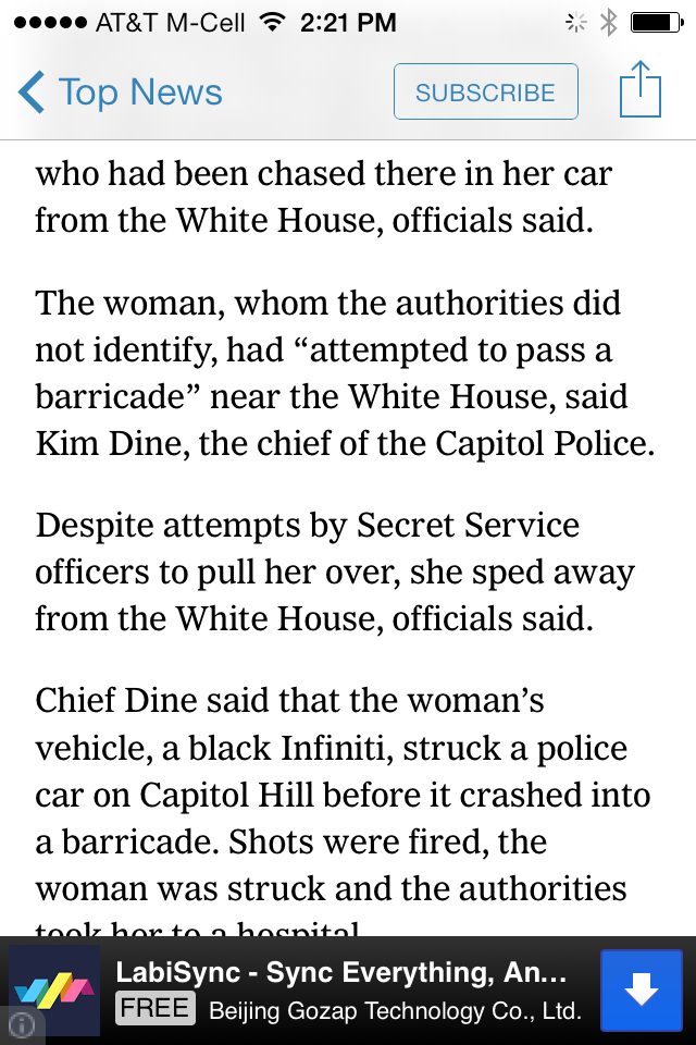
Here is an example. If, in Safari, the user were reading an article like the one on the left in the image below, she may accidentally trigger the control center while trying to scroll down:
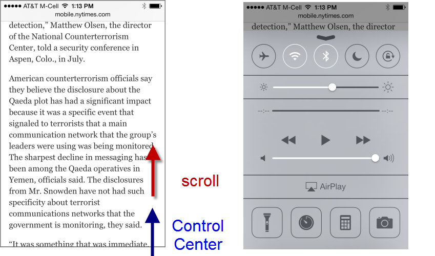 Scrolling vertically on a page can accidental trigger the Control Center.
Now, this functionality can be disabled in the iOS Settings by turning off the access to the control screen. But we know from previous testing that people rarely take the time to alter a default. (And a CHI 2007 study from Michigan State University showed that even tech-savvy users such as Slashdot readers rarely change the default interface.)
- Top edge: Spotlight Search and notifications. In the previous iOS versions the Spotlight Search(Apple’s global device search) was accessible by swiping on left edge of the first page of the device home screen. Users who had several app pages needed to navigate to the first one and then swipe on the left edge to invoke the search. In iOS 7, this interaction cost has been reduced:now users can access theSpotlight Search on any of the home-screen pages by swiping down somewhere below the status bar. This feature comes at the price of swipe ambiguity.
Indeed, users who want to search must be careful not to touch the top edge; if they did start their swipe gesture in the status bar, the Notification Center would appear instead of the Spotlight Search:
 Swiping for the Spotlight Search can accidentally trigger the Notification Center.
 -
Left edge: Safari. Another example of swipe ambiguity comes from Safari. In the newer Safari, swiping on the left edge of the screen takes the user back to the previous page. (Swiping on the left also means “up” or “back” in several other Apple apps – it looks Apple is trying to compensate for the lack of a Back button by using swipe as back consistently.)
Because of swipe as back, any webpage that contains a carousel can get into trouble in the new Safari: swiping the carousel back and forth (a fairly standard touch behavior) may take the users to the previous webpage instead of the previous image in the carousel.
Apple itself is not exempt from the swipe-ambiguity trap —Apple.com has a big carousel on the front page:
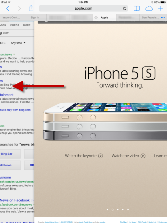 Swiping back to the first image of the carousel can accidentally lead outside the Apple site to the previous site that was visited.
With swiping as back Apple takes one more step into the realm of gesture-based interfaces. On touch screens, their allure is that they can take the place of interface widgets and free up screen space for content. Back in 2010 the first iPad interfaces tried to take advantage of gestures, but the result mostly confused users. New gestures were hard to memorize and discover, and sometimes even hard to replicate.
With the gestures embedded in its apps, Apple took the right approach most of the time: because gestures are fairly undiscoverable, they were assigned to nonessential, power-user features (for instance, shake to undo) or there were other ways to achieve the same effect. Thus, in the Mail app, users could (and still can) swipe to delete, or could take a detour and use the Edit button. Similarly, with the new iOS 7, they can swipe to go back to the previous page or they can use other visible controls (in Safari — the back arrow; in Mail, Settings, Contacts,and Notes — the back control in the navigation bar). Although we normally do not advocate redundancy in interfaces, gestural interfaces are one notable exception: because gestures have low affordance, discoverability, and memorability, some users never use them. That can be ok for more advanced features (such as theSpotlight Search or the Control Center), but it is not ok for basic interface functions such as navigating back to the previous page. In those cases, a button can save users hours of frustration.
Everything Else
We mentioned two issues that we think will give trouble to users in the iOS 7. There are other features that benefit the users, and we enumerate them here.
Hiding the controls in Safari. Web pages gain a few more pixels of content because the browser controls disappear shortly after the user navigates to a new page if she moves down the page, indicating that she wants to read it. Once the user starts scrolling up towards the top of the page, the controls reappear. This is good: Apple took the right route by not hiding controls altogether from the beginning; subtle cues such as scrolling up and down are rightly interpreted.
Unlimited number of files in a folder. Gone are the days when people were forced to have three Gamesfolders to host the many games apps they installed. Users won’t have to remember which game folder contained a specific game. Of course, now they will have to deal with finding that game within that unique folder. (But menu research shows that breadth is generally better than depth, so overall we think it’s a change for the better.)
Multitasking. Before iOS 7, one of the few differences that we observed between Android and iOS users was that Android owners were a lot more concerned with battery life and task management. Now the door has opened for iOS users to experience the same worries. (Apple says that their smart multitasking will protect the battery.)
On the plus side, apps can now update in the background and users won’t need to wait for the data to refresh when they open their favorite app.
Global font-size control. People can change the font size for all the apps that support dynamic font-size adjustment. This is a great feature, particularly for middle-aged or older users (provided that users will get to it and that apps will allow the adjustment – again, not many of us like to fiddle with the defaults).
Settings is more streamlined and easier to navigate. Do not disturb no longer lives in two different places (underNotifications and in the main Settings). And we have high hopes for a redesign change for the Wi-Fi page that previously caused many of our users some hassle:

When people wanted to select a network, in iOS 6 (left screenshot above) they would often tap the blue arrow on the same line, accidentally getting to the advanced Wi-Fi settings. Now the arrow has been replaced with a circled i , an icon usually associated with help or extra information. Presumably this change will make users more aware of the double functionality present in the table rows under Choose a Network —tap the circled i to get to the advanced screen, tap elsewhere in the row to select the network.
Change Is Bad
In this article we focused on interaction design, not visual style. However, both are components of the user experience, together with the writing:
- Visual style is how the system looks.
- Interaction is how the system feels.
- Content strategy is how the system sounds (or speaks).
Other sites have spilled many words over the new visual style in iOS 7. Most of these changes don’t matter for usability — like the new look or not; you’re going to use the screens the same.
However, one visual change does have negative usability implications: the new icon designs. Just as people have gotten used to looking for certain features under certain icons, all the icons sport a new look. Even just changing the background color of an icon is bad, because users would have gotten used to scanning the screen for “the red square” or something like that. Changing the actual content of an icon is even worse, because it destroys users’ ability to recognize it.
Apple has demolished millions of hours of user learning by changing the icons.
While definitely bad for usability, the icon changes are not a full-blown catastrophe because the visuals are supplemented by labels which don’t seem to have changed. So users can still find, say, the photo icon, even if they can’t recognize it anymore and thus have to spend more time looking for it.
Changing something people have gotten used to is bad in itself. It can be worth doing anyway if the new design is so much better that the long-term usability benefits outweigh the short-term penalty of relearning. Are these new icons that much better than the old ones? Probably not. But users will learn the new icons within the first month or so of upgrading, after which usability will have been restored. Unless Apple makes another radical icon change in iOS 8.
Is iOS 7 Fatally Flawed?
The short answer is no. Simply because there is no such thing as fatally flawed designs: we can always learn from mistakes. What’s surprising is that we don’t learn from someone else’s mistakes: Apple ignored some of the hurdles that Microsoft experienced with flat design and swipe ambiguity in Windows 8. We still have to see whether Apple’s strong design guidelines will protect most app designers from not getting lost in the flat 2D world. Early experience with applications redesigned for iOS 7 is fairly negative: several have worse usability than their iOS 6 versions.

