


Naninho said:
Technically speaking the ones on the left looks better, of course. Primarly as a consequence of the Vita's higher resolution. Then, we also have real-time shadows reflected on the character models, the water's transparency, etc. which are absent in the PSP version. That isn't really shocking, afterall, the Vita is a much more powerful hardware! That said, I prefer the ones on the right as I'm sure that the game was meant to look like those. Looking at the first comparison, the colors are more pleasant on PSP, and the overpopulation of herbs totally ruin the landscape on Vita (but "hey! we have enough power to put more plants, let's do it!"). In the second picture, I also prefer the simpler; opaque look of the water on PSP. The precarious shadow effect under the character's feet serves as a guide too! Honestly, on the Vita equivalent, I can't tell if those guys are standing over or underwater... Probably something wrong with me, but I have the same feelings toward several "enhanced ports". The new Wind Waker for Wii U, for example... I prefer how the GC original looks! |
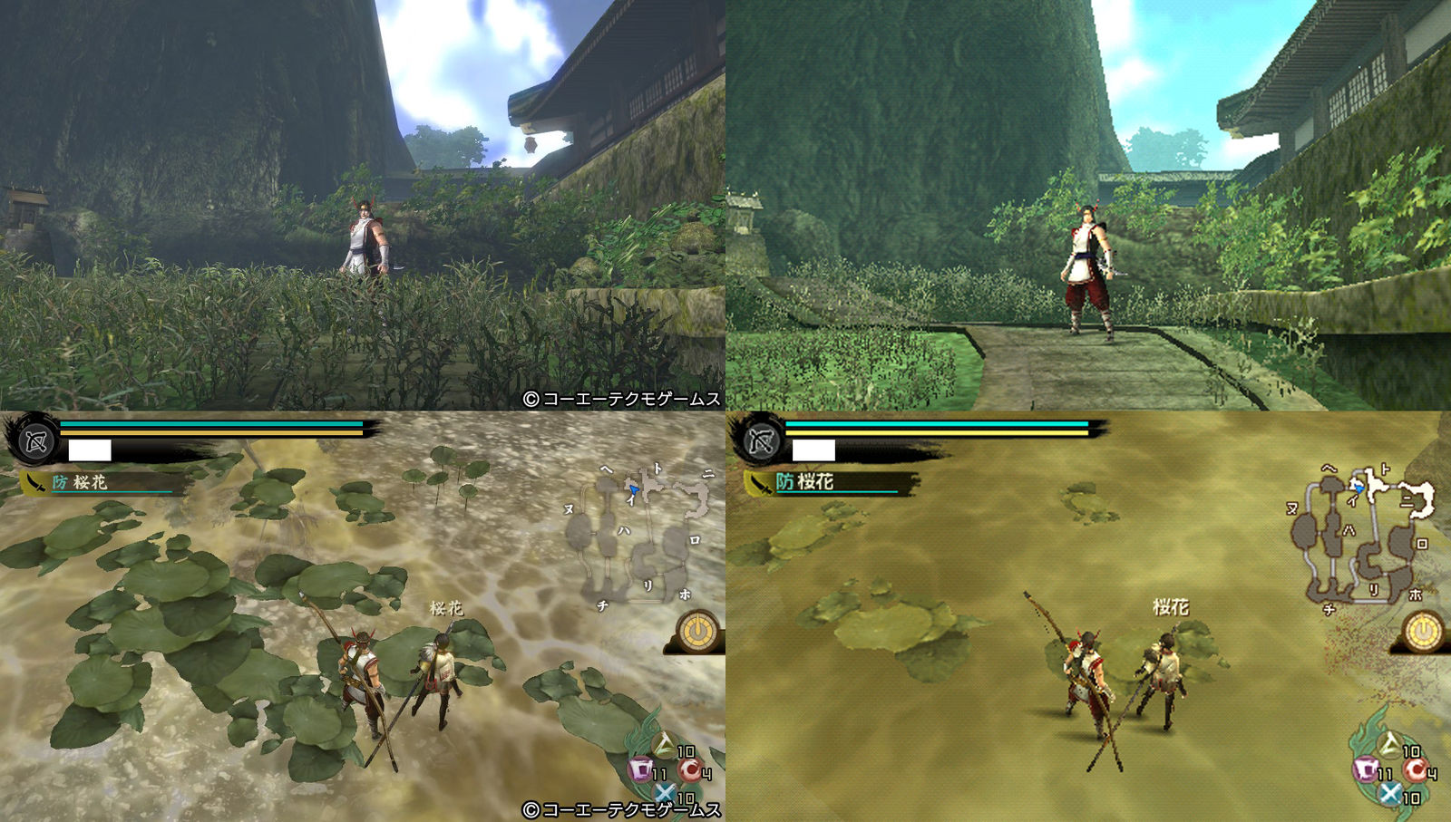
I see where your getting at here.. Sometimes higher quality games doesnt mean "Looks better"... The herbs looks way too messy and covers all of the ground.... Sometimes the more simpler approach looks better