


pokoko on 23 June 2013
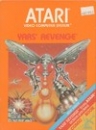
That's a really good design. The diagonal split and the red at the bottom is quite eye-catching, it makes it stand out, and the logo is nicely done. I also like the directness of the title, a simple font in all caps. Looks great compared to all the crazy, convoluted title logos we normally get. The guys at the bottom are kind of odd but they're most obscured.
I approve. It's a very bold cover that should attract attention.
