


Dahum on 12 June 2013
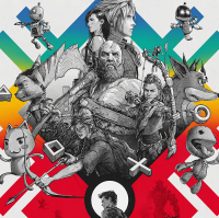
it doesn't appeal to me quite frankly. the upper half seems ok but the lower half with the running guy holding a gun seems repeated and generic as hell! i would have preferred a box art split in half where a helghast is on one side and a human is on the other.. or maybe a helghast at the lower of the cover and the city on the upper side.