MDMAlliance said:
HappySqurriel said:
MDMAlliance said:
All these comments about how Obama is the worst president and how people who can defend Obama are blind or whatever, and the comments about "liberals" or "democrats." You guys don't know anything, and you contribute nothing to this thread. You regurgitate what the media of your political party says, or what the people around you say. As for the Romney comments, it somewhat is the same way however it's not nearly as bad as the Obama ones.
It's strange how quick people are to claim that the job unemployment numbers and reports are BS and fixed, yet most of you saying that give no source that really shows you are correct. With all things considered in this situation, if Obama were really as bad of a president you think he is, our numbers would be significantly worse than they were when he got into office. Do you guys remember all the news reports of how high unemployment rates were? Exactly. |
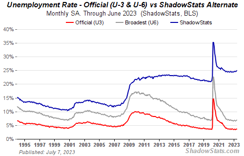
The job numbers are heavily manipulated. Over the years the methodology for calculating unemployment has changed and these changes have been to lower the labor force participation rate and therefore reduce unemployment. If we calculated unemployment without these mainpulations we would get the following:
http://www.shadowstats.com/alternate_data/unemployment-charts

As you can see, the traditional methods for calculating unemployment result in both dramatically higher unemployment rates and unemployment that has steadily increased since 2010. The primary reason for this difference is caused because, when the long term unemployed become discouraged and "give up" they are no longer seen as unemployed by the new statistics while they were based on the old methodologies.
In other words, the unemployment rate has fallen below 8% because the job market is so bad that millions of people have given up on ever finding work.
|
Isn't that chart showing that it's always being "manipulated" then? There's also not very much to say that the chart is reliable. Where does this person get his information from?
|
All of the data used by the Bureau of Labor Statistics is publicly available, and their methodology is well documented, so he uses the data they collected and calculates the unemployment rate using their old methodology.
Now, through most of the timeframe presented by this graph the unemployment trends have been (basically) the same regardless of the methodology used; with U3 being (roughly) 4% to 5% below U6, and U6 being roughly 4% to 5% below the classical methodology. After 2009 though there is a very drastic difference in the trend being demonstrated by the two methodologies, the official statistics demonstrate a decline in unemployment of (about) 2% while the tradional method demonstrates an increase in unemployment of (about) 2%. What this means is that the number of discouraged workers in the workforce increased from (roughly) 5% to (roughly) 10%.
If this trend continues over the next 4 years the unemployment rate may fall to 5% to 6% but there will probably be 12% to 15% of people who have simply given up on ever finding a job and have left the workforce; this would be a great political win for whoever is in charge but a massive personal loss to tens of millions of American households.


