As of late, SCEA's boxart division is showing themselves to be completely incompetent. I have complied a list of some recent disaster that showcase this terrible truth.
First up

The fail present here is astounding. Some chick with a wet T-shirt, a couple of dudes just...looking (probably for boobs) and a bad photoshopped cop that looks more out of place than me in the girl's locker room. For a game that'll probably have a difficult time selling, bad boxart is an unnecessary knock. The cover should be captivation and interesting, something that'll pull people in. What box art shouldn't be, is this.
Next up

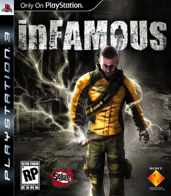
I'm gonna come out and say I loved Infamous. It's in my top 10 ps3 games for god sakes!!! But the boxart... OMG FAIL!!! Going from the top down, it seems good. Very cool logo, awesome name for a game... and then... blah. Some dude standing with what looks like a powdered donut in his hands. Not very interesting to say the least.
This game deserved better
(sigh)

Need I say more?
If the game is epic but the boxart is fail, does that make the situation an epic fail?

You're looking at it folks, SCEA's worst disaster EVA!!! Yeah, we understand Kratos is angry and, yes we know he has an eye. What's the point? Where is the EPICNESS!?!?! Truth be told, I do kinda like this boxart. But I'd take something epic over this any day. Plus, alot of people just straight up hate the art. If I was in a store and knew nothing about God of War, I'd probably pass this one by. That's sad...
Whose honestly running the show at SCEA? A competent human or Magilla Gorilla?
So what do you think guys, have any others?


