darthdevidem01 said:
disolitude said:
CGI-Quality said:
toru_bozu said:
disolitude said:
Kinda cliched don't you think? Oh wait, I forgot a lot of you aren't 20 yet.
Yes tough, badass!!! |
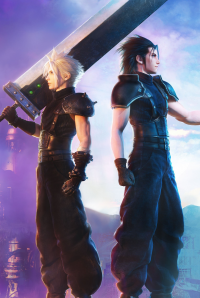
Cliched or not, doesn't mean it's not a nice box art (IMO). It could also be said to hundreds box art out there. I'm over 20, even play game before the 16bit era, and still find this box art looks nice to say the least... or "tough, badass!!!" :) |
I don't get that comment. It was condescending and uncalled for on his part.
|
No it isn't. That box art looks pretty but it doesn't hide the fact it doesn't offer anything new that we haven't seen before.
1. Hero of the game looking pissed - check
2. fire/explosions behind him - check
3. Million seller - check
I'm not saying its bad by any means, but its boring, cliched and not worth making a thread for. I know there are many games with lame box arts...but you guys are putting this one on the pedestal for some reason.
Here is some more shitty box arts you will love I guess.
And here is actually a cool box art. No one made a thread about this though as its not exclusive sadly...
|
Infamous's box art is DULL
Halo 3's is ok
This box art is AMAZING, the explosion, combinations of colour, the art style look, the shadow on his face, the crisp flaming swords with the glow of zeus's fortress in the distance, in a way telling the gamer of his aim & his mission. Finally the beacons of light shining from the heavens
a fantastic contrast.
I don't see that in the infamous or halo 3 box art, sorry.
|
Boxarts need to be more like FFXIII and show more legs ;]