By using this site, you agree to our Privacy Policy and our Terms of Use. Close
Lafiel said:

@ realill )

that logo looks very different to the one used on the box - both letters and the numbers are clearly in a different style

-the P has no enclosed room on the box (the top horizontal isn't connected to the vertical line at the bottom), while here it forms an enclosed room
-the middle part of the S is a straight line from top to bottom(vertical) on the box and here it's horizontal
-the 3 from the box is perfectly round on the right side and here it has sharp edges and a straight line at the right side

and those are just the most prominent differences.. there are even more


Both logos got big PS3 on top and a little Playstation 3 on the bottom. Yeas, fonts are different. I do not remember Sony using similar logos ever before it always was "Playstation 3".

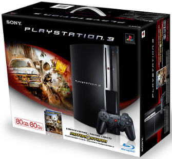
It looks like Sony done some rebranding, since Playstation 3 can not be used as logo, but PS3 can. Still can be coincidence.


Play my LittleBigLove level: search keywords "LittleBigLove realil"

LJ (Russian): http://realill.livejournal.com