
Trunkin on 24 May 2017
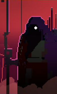
Why the hell is the contrast in the Switch version so high? I kind of like the softer look of the PS4 version.


Why the hell is the contrast in the Switch version so high? I kind of like the softer look of the PS4 version.

It looks like the PS4 version might have more advanced lighting, but the game might look better in many instances without that lighting.

Yeah, looks like different times of day. The Switch version looks like evening shots.
| Phronesis said: Switch does looks better, however, it's a compressed image. Probably PS4 is better irl. |
They should look about the same as long as it's decently optimised on both. The Switch is capable of keeping up with technically reserved titles, and stuff like Rime fall into that box.

The footage is outdated as already mentioned. Released game on Ps4 has the same colors:
https://www.youtube.com/watch?v=pPlBgCaWhRo

Yeah, something about that comparison looks off. I'd assume that they'd looker closer to each other than that.

If anyone actually took the time to watch the trailer on YouTube they'd know this post is bs.

The PS4 version makes me feel sleepy and bored. The Switch version makes me happy and full of energy like a young kid. But that doesn't make up for lack of Achievements. PS4 version if I had to choose. 
I instinctively thought the left pictures were Switch and the PS4 pics were on the right... I much prefer the Switch's visuals as the other one looks like it's being shot through a dirty lens.
That's rather strange, and I suspect the PS4's visuals are nicer than these pictures suggest (and I can see that it sports water effects that were left out of the Switch version). Still, it's good to see that the game looks so nice on the Switch regardless... I'm sure Digital Foundry will have a comparison video any minute now :)

OK, better contrast, brighter colours and shadowing in the Switch version
About Us |
Terms of Use |
Privacy Policy |
Advertise |
Staff |
Contact
Display As Desktop
Display As Mobile
© 2006-2026 VGChartz Ltd. All rights reserved.


