By using this site, you agree to our Privacy Policy and our Terms of Use. Close

Forums - Gaming - Video game box art text problem

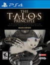
For last few years we are seeing video game box arts that are full of so many texts that it is not funny anymore. IMO box arts should be neat and clean. But it looks like text after text filled in the box art.

Original:


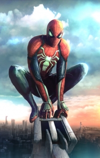
Parody: And this version looks better.


How about this?


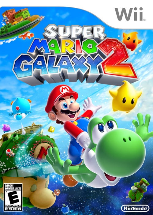
And future will be like this.


Or something simple yet nice like this?


Around the Network

I like Box Arts with texts, as long as they don't mean:


· Whatever crap DLC it has included. (On the front)

· Whatever score it got in whatever page.
· "Better with Kinect" or crap like that.


GOTY Red Dead Redemption is the best example of good box art without ruined by anything like that ^


Mind you, that "Winner of.." thing isn't a text wall, but a sticker :P


Wright said:

I like Box Arts with texts, as long as they don't mean:


· Whatever crap DLC it has included. (On the front)

· Whatever score it got in whatever page.
· "Better with Kinect" or crap like that.


GOTY Red Dead Redemption is the best example of good box art without ruined by anything like that ^


Mind you, that "Winner of.." thing isn't a text wall, but a sticker :P


Yup. And rockstar's game speacks for themselves. Here is my copy which I hasnt sold and will keep in my collection forever.