VGPolyglot on 01 November 2017
Wow, I actually forgot about Fire Emblem for Switch. I really want to see what the gameplay for that game will look like.


Wow, I actually forgot about Fire Emblem for Switch. I really want to see what the gameplay for that game will look like.

Nice to see Dragon Quest and Ni no Kuni so high.

Yay Xenoblade taking that #1!
We really need new announcement for Switch games.
Pocky Lover Boy!

What a surprise.


Thanks for your work axum!
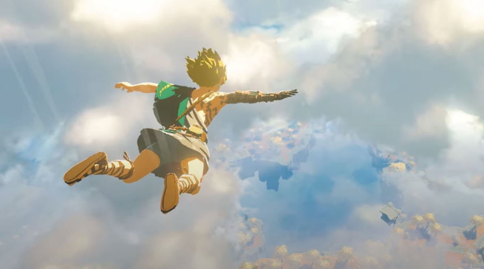
I still don't understand how can Metroid be so high in the list considering that we know absolutely nothing about it. And it's more shocking if we compare it with Pokemon, an incredibly more popular game that's on the same situation, yet has less than half the points and votes of Metroid. Maybe once Xenoblade launches, people will vote for Pikachu & Co.
Beyond that, things keep as usual: Sony/PS4 dominating in number of games with Nintendo/Switch dominating in votes.
Ka-pi96 said:
They're mostly readable. It's a bit odd seeing them so thing with all the columns bunched up, but that's fine. I can't read the PS4 titles though. That black text against a dark blue background really doesn't work |
I have that problem with either Firefox or IE, but the charts look ok in Opera. Don't know about Chrome.
Please excuse my bad English.
Currently gaming on a PC with an i5-4670k@stock (for now), 16Gb RAM 1600 MHz and a GTX 1070
Steam / Live / NNID : jonxiquet Add me if you want, but I'm a single player gamer.


| axumblade said: okay guys. Time to ask for some feedback, which colors do you guys think need changing the most? The ones I have issues with are the red for Nintendo and the blue for Sony. |
What do you mean with "issues"?
Please excuse my bad English.
Currently gaming on a PC with an i5-4670k@stock (for now), 16Gb RAM 1600 MHz and a GTX 1070
Steam / Live / NNID : jonxiquet Add me if you want, but I'm a single player gamer.
| axumblade said: okay guys. Time to ask for some feedback, which colors do you guys think need changing the most? The ones I have issues with are the red for Nintendo and the blue for Sony. |
I think the colors for Switch and PS4 need to be toned down a tiny bit, especially PS4.
Regular text with a dark background is barely readable.
"Just for comparison Uncharted 4 was 20x bigger than Splatoon 2. This shows the huge difference between Sony's first-party games and Nintendo's first-party games."

axumblade said:
Readability. Quite a few people are saying that it kinda hurts their eyes to read the current color scheme. |
They look perfectly readable to me. But if people are having issues with readability, I think that simply a softer red and blue should fix that.
Something like this should be fine:
https://www.google.be/search?q=%23a196ff&source=lnms&sa=X&ved=0ahUKEwia0q_a_qfXAhVB_KQKHVLZDrEQ_AUICSgA&biw=1366&bih=637&dpr=1&gws_rd=cr&dcr=0&ei=ik7_WcG3JYSTkwW8iYLwAw

About Us |
Terms of Use |
Privacy Policy |
Advertise |
Staff |
Contact
Display As Desktop
Display As Mobile
© 2006-2024 VGChartz Ltd. All rights reserved.