By using this site, you agree to our Privacy Policy and our Terms of Use. Close

Forums - Gaming Discussion - FF13 Graphics Changes in Action

FF13 Graphics Changes in Action

Link: http://www.uffsite.net/news/232/ff13-graphics-changes-in-action.html

FF13 Graphics Changes in Action

AP | August 2, 2009


Some of the graphical changes made by Square Enix to later builds of Final Fantasy XIII are becoming clear when released screenshots are studied and compared by fans.

Two released screenshots are almost identical but are from different builds, giving fans a look at changes made to the game engine. The question on the lips of many fans will be why these changes have been made.

The first screenshot here was released by Square Enix in August 2008, before Advent Children Complete shipped. This screenshot is from the older build of the game.


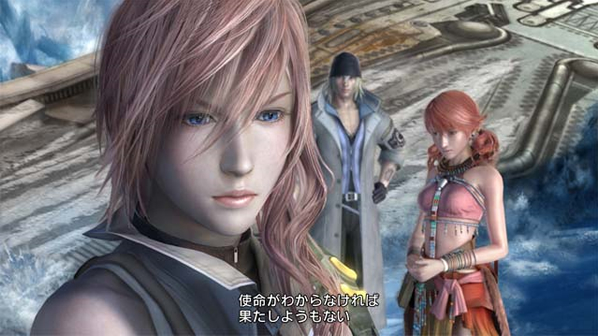
Before moving on to the next screen, make note of the floor textures, rocky sea and the hair of the characters.

The next image is a screen from the video featured on the exclusive Final Fantasy XIII footage found on the Western Advent Children Complete Disc - and a later build of the game than the screenshot above.


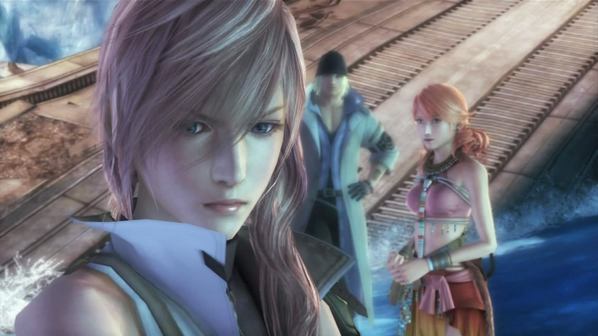
Take note again of the changes in the floor texture - in this newer build of the game it is a slightly more simple design. The sea is considerably less choppy and the hair of the characters is quite different - possibly rendered in a different way.

More subtle changes in the images include the textures of Lightning's clothes and her shoulders are considerably less rounded in the later build. The game also appears to have added depth of field effects, throwing the Snow and Vanille in the background out of focus.

Us at UFFSite? We believe that the early shots were likely doctored, improved or running on the Crystal Tools engine on PC - we're likely now just seeing true screenshots of the game, which still look amazing.

The real question is, which one looks better? Let us know in the comments box, on our forums or Tweet at us on our Twitter!


(I think the 2nd shot looks pretty blurry. All the comments from that site are feeling like they downgraded the game) 


Around the Network

in b4 anyone says "Now it looks crap for suck box 360 version."


Random game thought :
Why is Bionic Commando Rearmed 2 getting so much hate? We finally get a real game and they're not even satisfied... I'm starting to hate the gaming community so f****** much...

Watch my insane gameplay videos on my YouTube page!

there is a noticeable difference between the to the top one looks far better


wow.........That is a huge difference........that better not be cause of the 360.......cause there will be hell to pay >:(


The faces themselves look a lot better in the second version. This looks like a big improvement to me.


I'm a mod, come to me if there's mod'n to do. 

Chrizum is the best thing to happen to the internet, Period.

Serves me right for challenging his sales predictions!

Bet with dsisister44: Red Steel 2 will sell 1 million within it's first 365 days of sales.

Around the Network

The first screen looks much better than the 2nd one, the newer one looks much more bland and dull to be honest, whereas the previous screen has really deep and vibrant colours! I imagine that the first was from CGI and then 2nd being from game-play but the demo i played of the game looked great so hope the final build is ok!

I doubt it is the 360 to blame but you never know with these things...


Faces look slightly better, although i prefer Lightnings older look.

Lightnings hair looks worse.
Clothes look worse.
Looks to be less colourful.


I was making fun of the Cloud/FFVII fanboys for how similar Lightning looks to Cloud (literally just a hair change), but I don't like how she looks in the second pic =/ Doesn't seem as feisty.


1st is the PS3 version
2nd is the 360 version
lol sorry couldn't resist


Man.. the first screenshot is more colourfull and detailed....hopefully this is not because of the x360.... but wel.. id do think soo..