By using this site, you agree to our Privacy Policy and our Terms of Use. Close

Forums - Nintendo Discussion - Metroid Prime 3 Cover

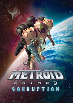
I know that covers are trivial aspects of games to discuss, but I am curious what you guys think of the MP3 cover.  Other boards have been blasting it saying it is one of the worst they have seen and even 1up listed it as one of the worst ever.  I don't understand how they can say this since I think it is one of the most effective covers I have seen.  All of the negativity has been about the fact that there is no action, or there are too many Samuses in the pic.  I don't know what they want, but the backwards mirror image with Dark Samus I think makes it all the more epic and really highlights the duality of the two and how they are connected.  I'm sorry that this is taking up space, but it annoyed me that so many people were against it and then I had to rant a bit.  So what do you guys think of it?


Engage!

Around the Network

for reference...


Yeah i'm really sure that this is the best boxart that i've seen from a prime game. It has very nice artwork and a cool background for that epic space/world ambiance. The only thing i don't like is the "reflection" of dark samus in the upper left corner. I also hope that the cover will be shiny and stuff, to show that this is the legendary "last of the prime series".


Wii Friend Code: 7356 3455 0732 3498 PM me if you add me

It's not bad...I could pull out endless games that have much worse...


LEFT4DEAD411.COM
Bet with disolitude: Left4Dead will have a higher Metacritic rating than Project Origin, 3 months after the second game's release.  (hasn't been 3 months but it looks like I won :-p )

BenKenobi88 said:
It's not bad...I could pull out endless games that have much worse...

Or you could check out 1up's (currently) three part feature of bad box covers. In fact, MP3 has made it on their most recent list of bad covers.


http://www.1up.com/do/feature?cId=3162014


Around the Network

I think the boxart would have looked much better had they just taken Metroid Prime 1's cover and replaced Samus Aran with a dark corrupted(?) version but have the same pose. Basically a dark version of MP1's cover. Replace the yellow/orange/gold in the cover to a red/black/silver color scheme.

Actually the image I have in my head of that cover looks amazing, I should make up a fan boxart for the game.


I don't mind the back to back Samus but the one at half opacity in the top left corner should not have been included. Does that make is the worst box art ever? Hardly.


To cash in my CC rewards points for $300 in Circuit City gift cards to purchase a 360 or not: That is the question.

I'm definitely not playing that cover!


I don't know what 1up were thinking. I think this cover is the best of the three.


3DS FC: 1306 6473 7511

Nintendod Network ID: xsorenx

Add me for Pokemon, New Leaf, and Fire Emblem, Mario Kart 8.

Thats a very good cover better than the other MP's by far 1up are just idiots if they think this is bad boxart.


End of 2014 Hardware Predictions (03/03/14)

PlayStation 4: 12-15million

Xbox One: 7-10 million

Wii U: 8-9 million (Changed 01/04/2014 from 7-9 --> 8-9 million)