By using this site, you agree to our Privacy Policy and our Terms of Use. Close

Forums - Microsoft Discussion - The next Microsoft dashboard looks like PSN had a baby with Xbox Live . It looks good.

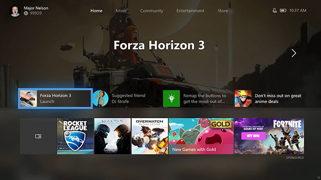
Imagine you took the essential overall layout of PSN and added the stylish yet minimalist style of Xbox Live. This is what the new update looks like. Sure, it will be more customizable but its essentially the same layout which makes it simpler to put things in their proper place. Ever since Microsoft took away the snap app it looks like this was the direction they were headed in. Im guessing its a simple and secondary way for Microsoft to stay competitive, since this is the only way they can do it. Nevertheless this should make it easier to choose some really sweet achievement wallpapers that ive been dying to use now.  Its going to be odd though because Microsoft doesnt have dynamic themes, but I like the tab in the left hand and corner (like PSN )now that acts like a mini control center. Its just getting used to the fact that the options are horizotal instead of vertical which Sony is left hand tab is moreso like. Now that Xbox got spotify I can use it the same way as I use PSN now as well. Cant wait until it drops. Its more minimalist and a little less cluttered with media types than PSN which is a plus. All Xbox needs is gameshare and they will be all caught up. :)

Its going to be nice customizing the way I want to see my games though. Ooooo

What do you think?


Around the Network

i watched thr video and was like.. this looks like PS4 too XD

not a bad thing


2018 Hit List: Shadow of the Colossus, Detroit, Dreams, Spider-Man, God Of War, Days Gone, Medievil, Tomb Raider 3, RDR2 

merman said:
i watched thr video and was like.. this looks like PS4 too XD

not a bad thing

Yeah....MS made a more stylish PSN. Sony should take notes. I mean its note really that important in the long run, but its a nice addition for homeliness and customization.


"imitation is the sincerest form of flattery"


My favorite was the 360 blades. I thought the original XBO interface was fine but the way it is now is overly complicated. The next one can't be worse.

I just hope they find one and stick to it. Whenever I get used to one, it changes. What is this? The fourth time?


Around the Network
d21lewis said:

My favorite was the 360 blades. I thought the original XBO interface was fine but the way it is now is overly complicated. The next one can't be worse.

I just hope they find one and stick to it. Whenever I get used to one, it changes. What is this? The fourth time?

I used to hate that about MS Word.

They would constantly change icons, and move stuff around (or use new words/names for funktions).

To a degree each new windows version has some of this too, its just annouying when they seemingly do it for no reason.


My favorite dashboard of all time is still the one that is currently on the 360 its easy to use well organized and visually appealing.


d21lewis said:

My favorite was the 360 blades. I thought the original XBO interface was fine but the way it is now is overly complicated. The next one can't be worse.

I just hope they find one and stick to it. Whenever I get used to one, it changes. What is this? The fourth time?

Actually, the psn style is simpler and more minimalist. Trust me, you'll be able to navigate easier. It might not be as appealing At first but it will grow on you for sure.


CGI-Quality said:
Told people that PSN's interface was nicer/cleaner. Perhaps Microsoft got the memo!

Seems they did. I've been saying this for a while now. Wouldn't Microsoft dynamic themes look nice? The background looks visible and clean for once. 


JRPGfan said:
d21lewis said:

My favorite was the 360 blades. I thought the original XBO interface was fine but the way it is now is overly complicated. The next one can't be worse.

I just hope they find one and stick to it. Whenever I get used to one, it changes. What is this? The fourth time?

I used to hate that about MS Word.

They would constantly change icons, and move stuff around (or use new words/names for funktions).

To a degree each new windows version has some of this too, its just annouying when they seemingly do it for no reason.

Microsofts minimalist style was inspired by Apple. Instead of using more shapely minimalist forms micorsoft uses boxes.They try to liken themselves to their closets competiton. It's the same way they are trying to replicate apples trchnological synergy between products into a lifestyle product.