JazzB1987 on 16 September 2014
where is the color? It looks as bland as the new Xenoblade (compared to the old Xenoblade that is)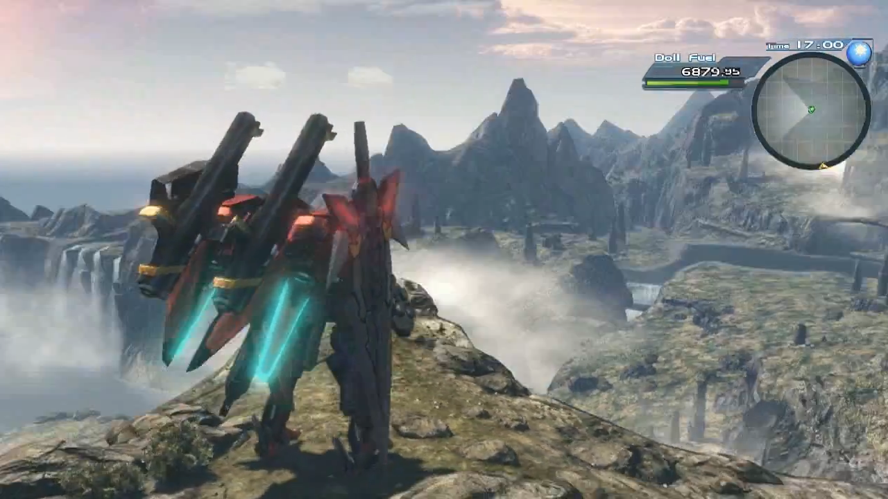
Washed out grey/brown mess. T.T
The graphics look good the design totally does not tho
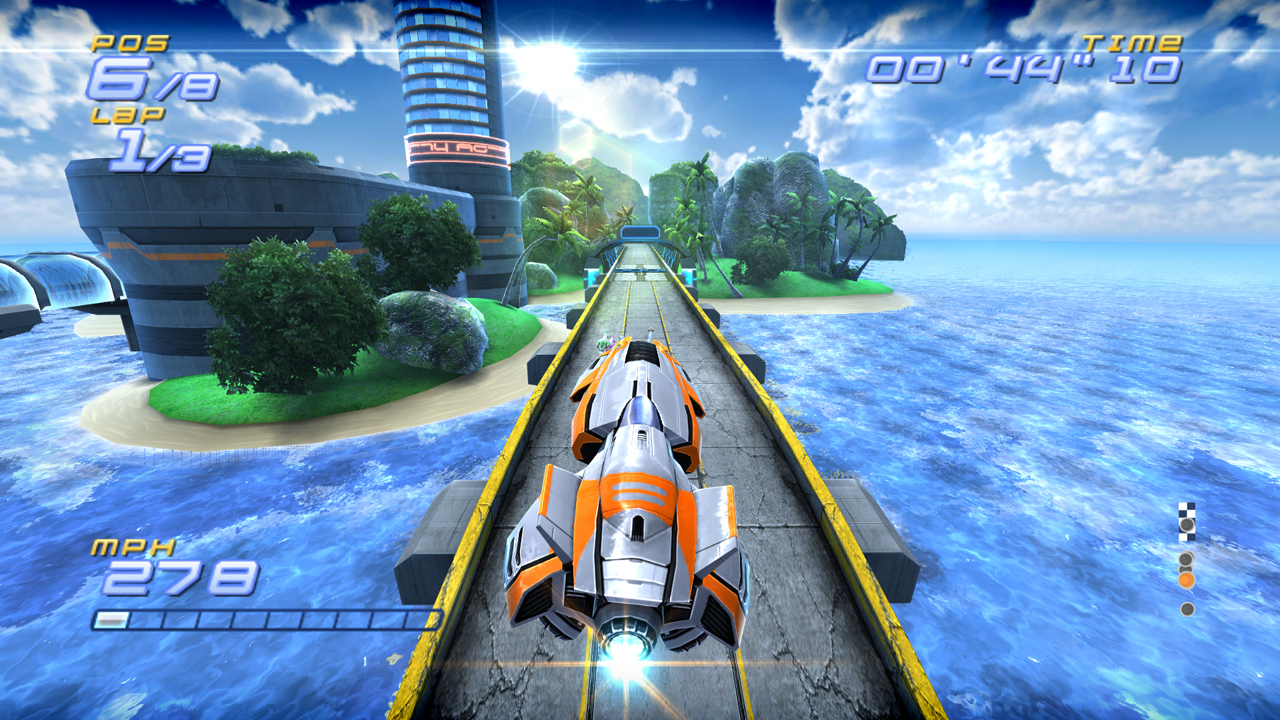
They should look at their old FAST game on Wii so they know how a scifi racer has to look like.