By using this site, you agree to our Privacy Policy and our Terms of Use. Close

Forums - Nintendo Discussion - Bayonetta 2 box art changed because of Hideki Kamiya ? ( in Europe ? )

Hideki Kamiya June 2014

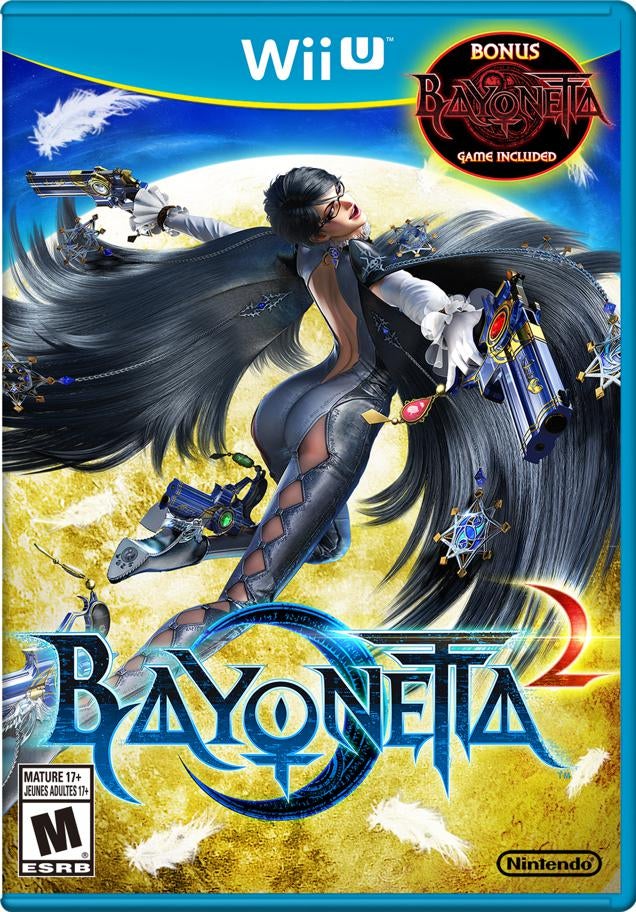
"I hate the logo of WiiU ver.," tweeted the outspoken game creator in English. "Junk." In Japanese, Kamiya was slightly more salty, tweeting, "The Bayo 2 package is shit. Who's the damned bastard who changed it..."

Now see the new background in the first print edition trailer:

https://www.youtube.com/watch?v=CMYp7wEJlbc&list=UUnGLJZ0XFEWN0DW5nr6vgnQW

Which one do you like more ? 

I say: GOOD JOB HIDEKI ! :D 


Around the Network

I like the EU version better cause of the clouds


PC Specs: CPU: 7800X3D || GPU: Strix 4090 || RAM: 32GB DDR5 6000 || Main SSD: WD 2TB SN850

Jizz_Beard_thePirate said:
I like the EU version better cause of the clouds


yeah I think the moon was too yellow :D 


They both look good to me. I don't really understand what the issue is here.


Nothing wrong with either of them...they are both really nice looking


Around the Network

what's up with yellow/gold Nintendo covers for the NA. Anyways I agree, I like the EU one better.


QuintonMcLeod said:

They both look good to me. I don't really understand what the issue is here.


When asked why he was upset, Kamiya replied, "They removed the crescent behind Bayo & put full moon & changed the color of "2" in red. JUNK."


I prefer EU version. Too much gold/yellow in the other one.


AwakeandAlive said:
QuintonMcLeod said:

They both look good to me. I don't really understand what the issue is here.


When asked why he was upset, Kamiya replied, "They removed the crescent behind Bayo & put full moon & changed the color of "2" in red. JUNK."

Oh... You mean this:


To compensate for the ugly USK logos...
Only the Solus Edition is available without a USK logo.